
Barber Booking Platform
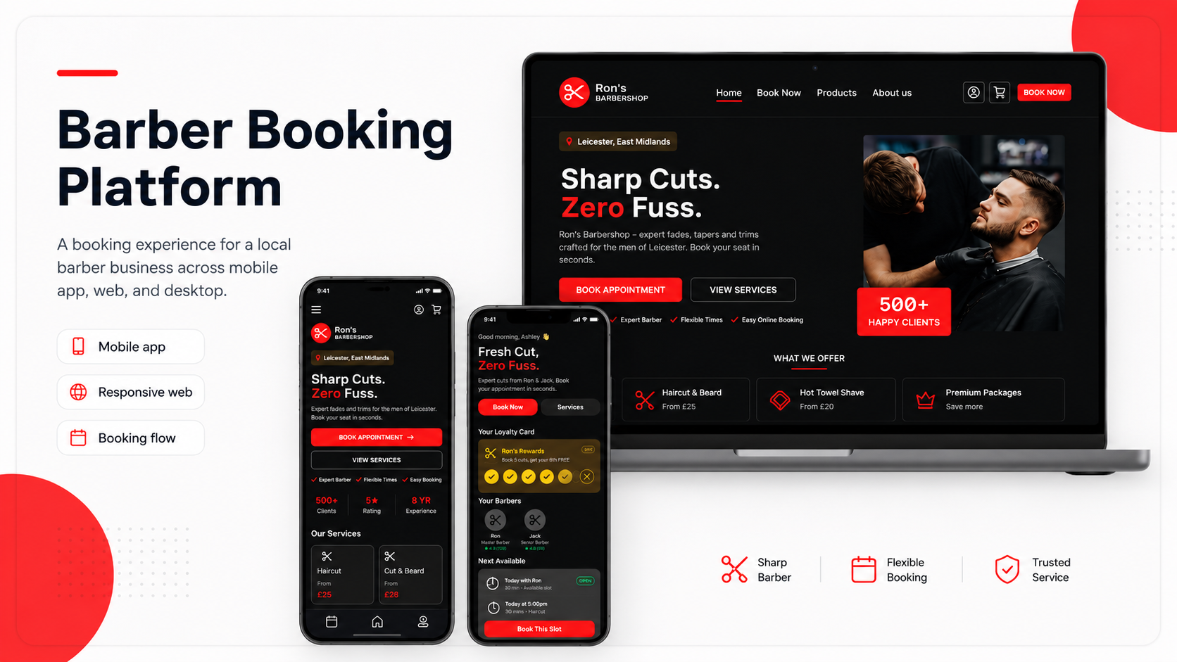
A booking platform helping local barber customers choose services, book appointments, and confirm details quickly.
Role: UX/UI Designer
Project type: Mobile app, mobile website, and desktop website
Tools: Figma, paper wireframes, digital wireframes, prototypes
Focus: Booking UX, local business, responsive design, service selection
Status: Concept portfolio project
Overview
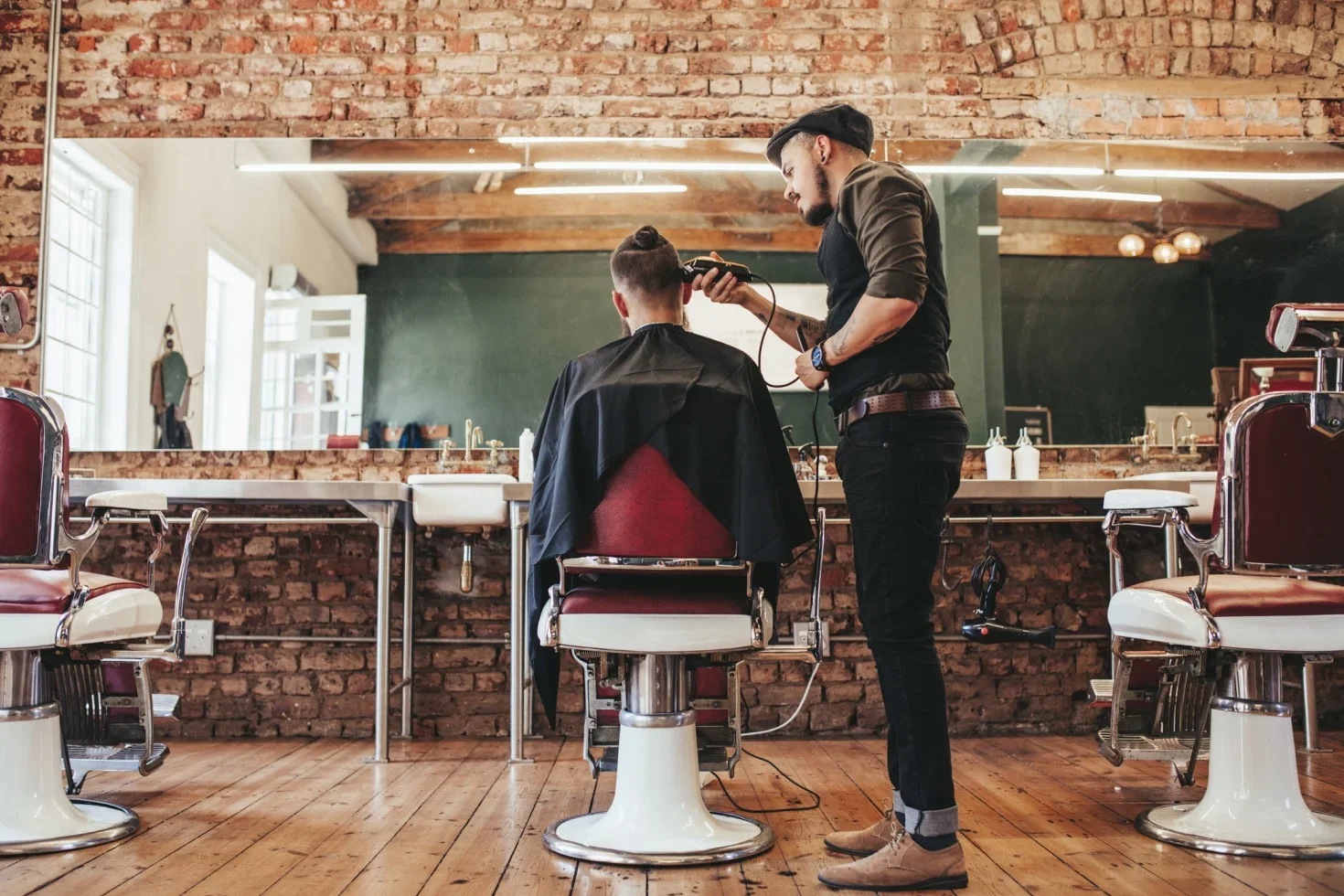
The Barber Booking Platform is a booking experience designed for a local barber business.
The project includes a mobile app, mobile website, and desktop website. Users can browse services, choose a barber, select a time, review their booking details, and confirm their appointment.
The aim was to create a fast, confident booking experience that feels modern, simple, and suitable for a local barber brand.
The Problem
Many small businesses still rely on messages, phone calls, or informal booking methods. This can make it harder for customers to know what times are available, what services cost, and whether their booking is confirmed.
For barber customers, the experience needs to be quick. Users usually want to:
see available services
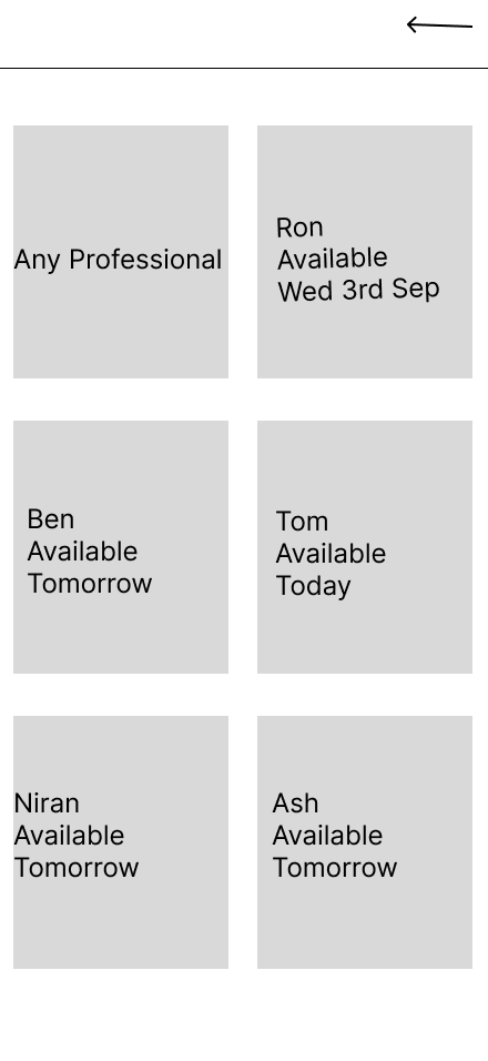
choose a barber
compare prices
pick a time
review the booking
understand cancellation rules
receive confirmation
The challenge was to create a booking flow that reduced friction and helped users feel confident.
The goal
The goal was to design a booking platform that helps users:
quickly understand the barber service
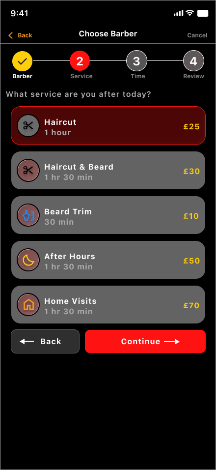
choose a service
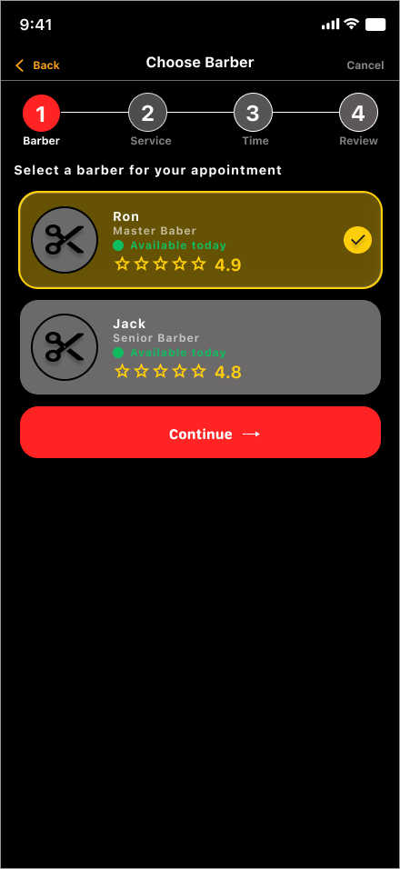
select a barber
pick an available time
review appointment details
confirm the booking
understand booking policies
The design also needed to feel visually strong and suitable for a modern local barber brand.
Target users
The target users are men and boys in Leicester and the East Midlands looking to book barber appointments.
They may include:
regular customers
new customers comparing services
users booking quickly on mobile
users who want clear pricing
users who want flexible appointment times
users who want confirmation before attending
The design needed to feel fast, direct, and easy to use.
My role
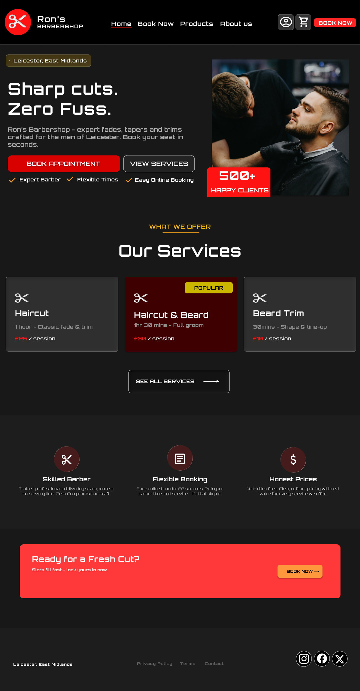
I designed the full booking experience across mobile app, mobile website, and desktop website.
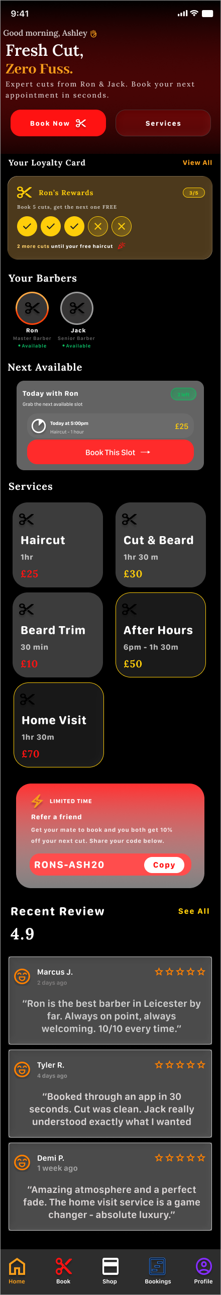
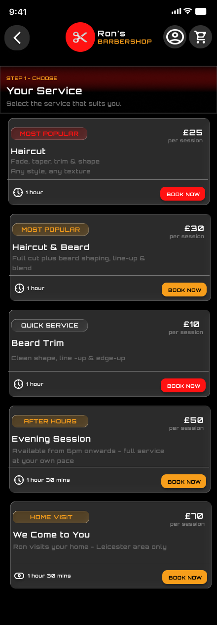
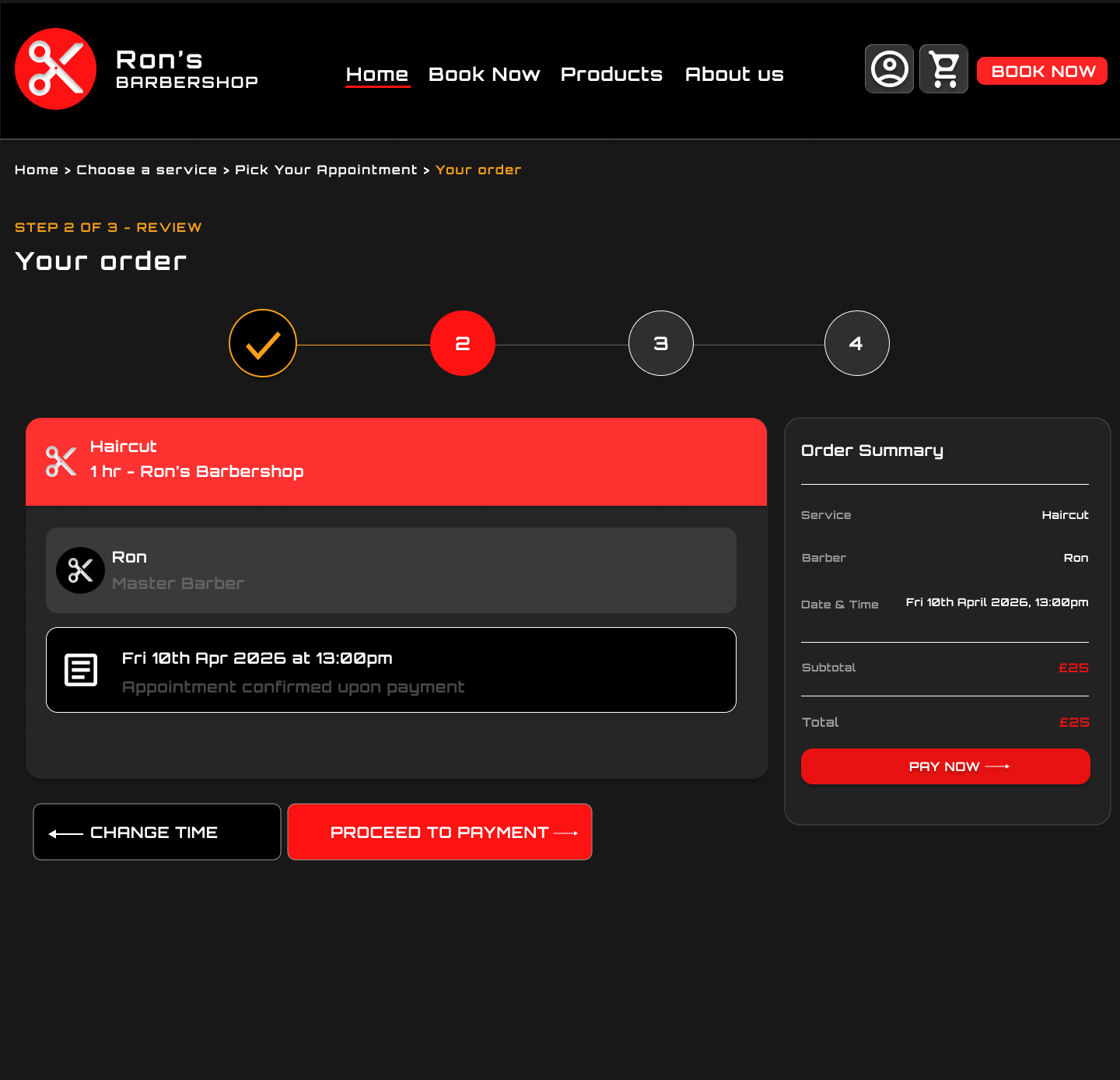
This included designing the homepage, service cards, barber selection, time selection, booking review page, payment/review step, and confirmation page.
My focus was on reducing booking friction while creating a strong visual identity for the barber brand.


Key insights that shaped the design:
1. Users want to book quickly
The main call to action needed to be clear and visible.
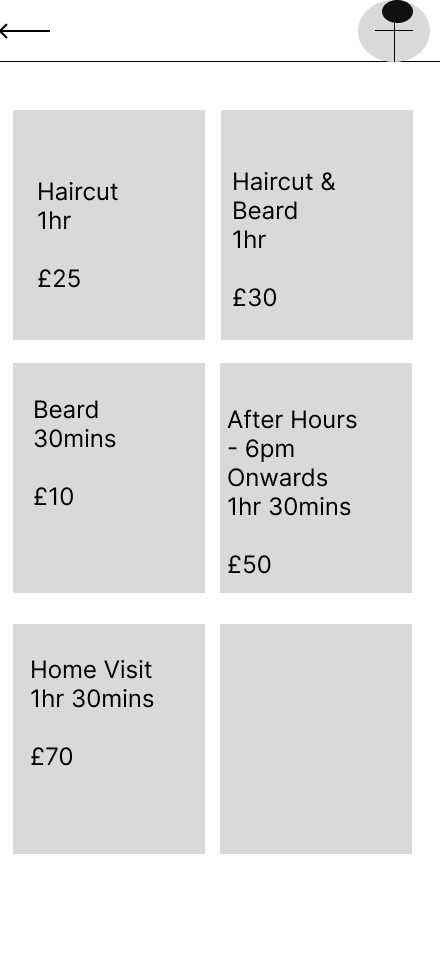
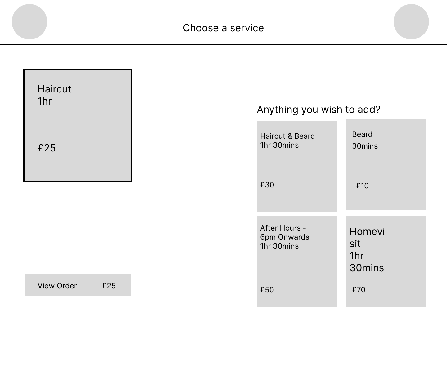
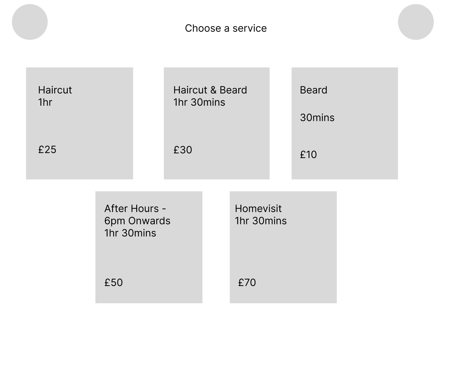
2. Service details need to be simple
Users need to understand price, duration, and what each service includes.
3. Trust matters before booking
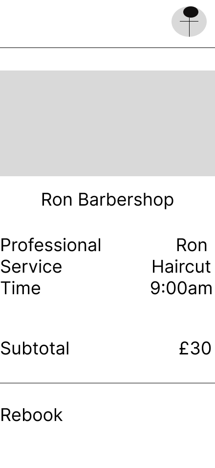
Ratings, barber profiles, loyalty cards, and confirmation screens help users feel confident.
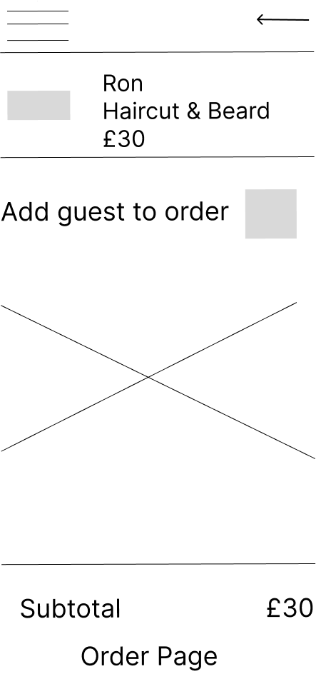
4. Review before confirmation is important
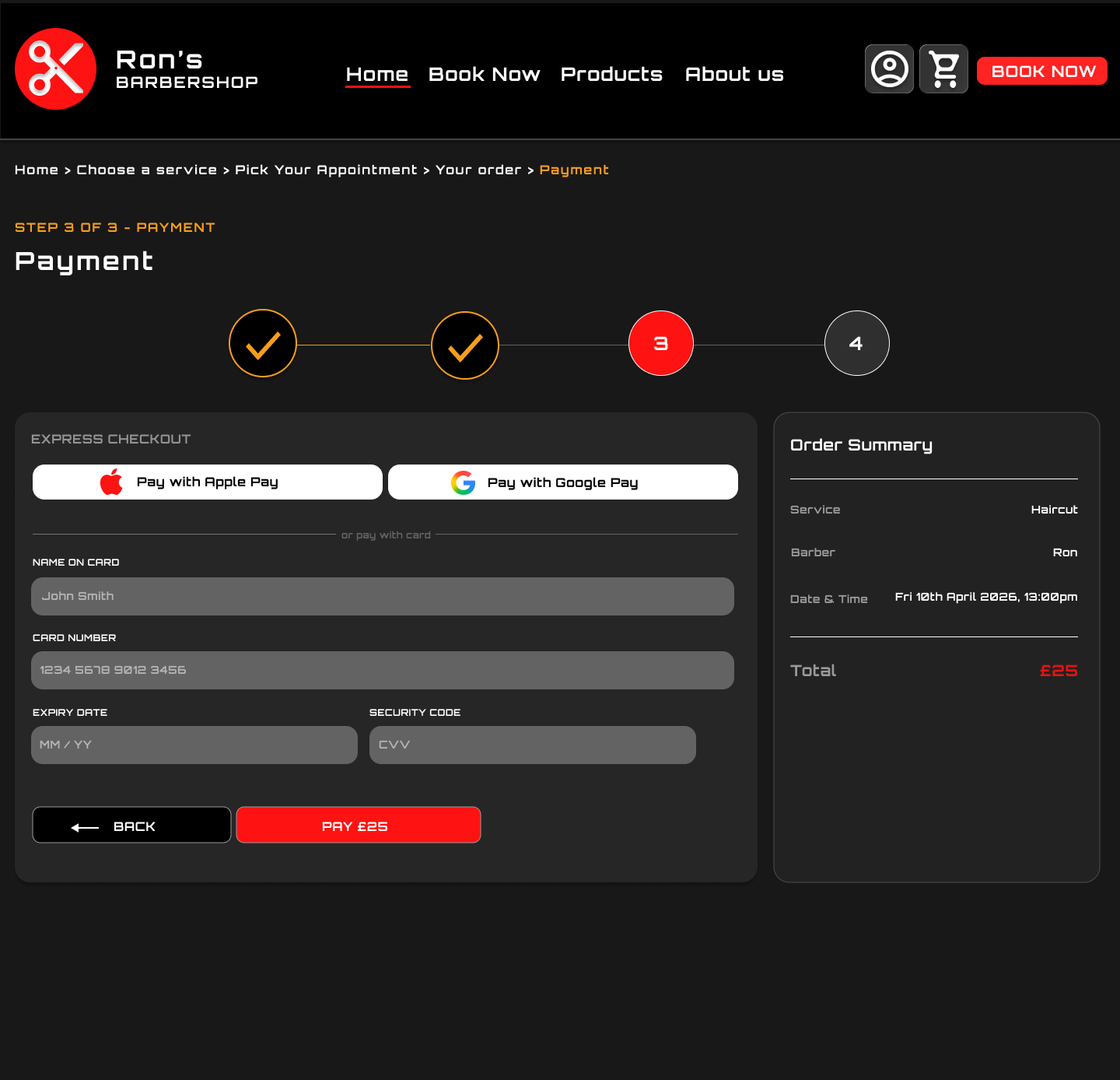
Users should be able to check the barber, service, time, location, price, and policy before confirming.
The main journey is:
Homepage → Choose barber → Choose service → Pick time → Review booking → Confirm booking
For the website version, the journey is:
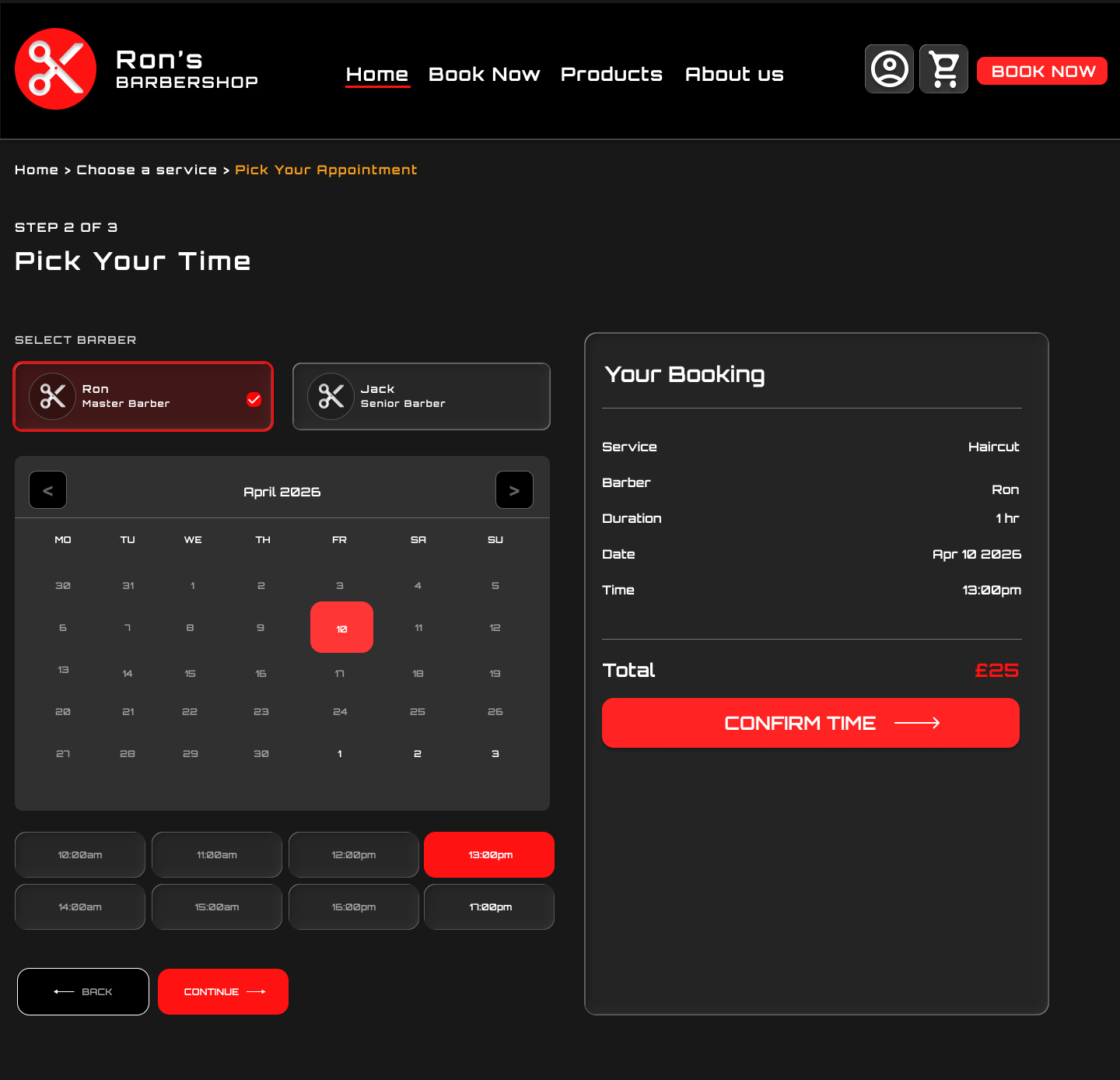
Homepage → Choose service → Pick time → Review order → Payment/review → Booking confirmation
This flow helps users move from discovery to booking with minimal friction.
Design system/ Component sticker sheet
I created a component sticker sheet to keep the barber booking experience consistent across mobile app, mobile website, and desktop website. The system included service cards, barber profile cards, booking buttons, progress indicators, loyalty card components, price labels, icons, navigation, and confirmation states.
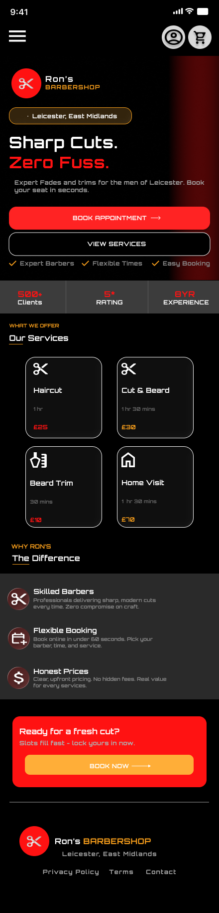
The visual style uses a bold black, red, and yellow colour palette to match the sharp, confident feel of a modern barber brand. Strong contrast, large CTAs, and clear service cards help users move quickly through the booking journey.
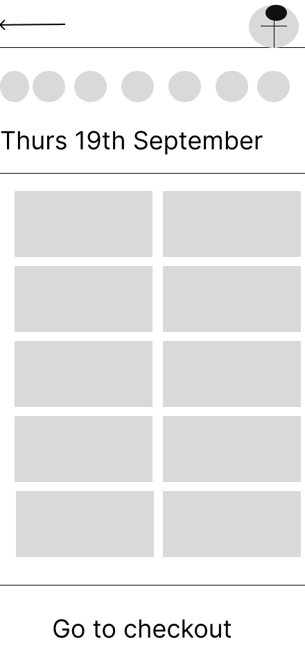
I started by mapping the key booking steps. The main challenge was making sure the user always understood where they were in the process.
The mobile app uses a step indicator to show progress through barber, service, time, and review. The website uses clearer page-based steps to support a wider layout.
The early wireframes helped me refine how service cards, price details, and booking actions should be displayed.
Key design decisions
1. Strong brand identity
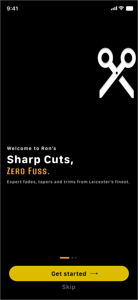
The design uses a bold black, red, and yellow colour palette to create a sharp, modern barber brand.
This makes the experience feel confident and memorable.
2. Clear booking calls to action
Buttons such as “Book Now”, “Book Appointment”, and “Book This Slot” are placed prominently so users always know what to do next.
3. Step-by-step booking flow
The mobile app uses a progress indicator to show each stage of the booking process. This helps users understand how close they are to confirming.
4. Trust and reassurance
I included barber profiles, ratings, loyalty rewards, service details, pricing, and confirmation screens to build trust before and after booking.
5. Responsive design across devices
The project includes a mobile app, mobile website, and desktop website. This allowed me to explore how the same booking journey changes across different screen sizes.
Final Designs

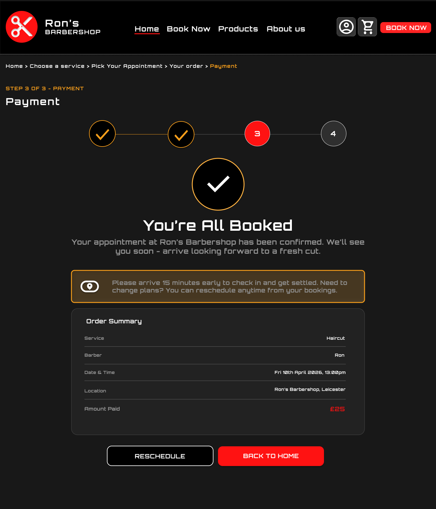
The final design presents a bold, high-contrast booking experience. It uses strong visual hierarchy, clear pricing, service cards, and direct calls to action.
Responsive design
This project allowed me to design across three formats: mobile app, mobile website, and desktop website.
The mobile app focuses on a guided step-by-step booking flow.
The mobile website gives users a fast browser-based version of the same experience.
The desktop website uses more horizontal space to show service cards, brand messaging, and booking details clearly.
This helped me practise designing one service across multiple platforms while keeping the experience consistent.
Accessibility and usability
Although the design uses a bold dark visual style, usability was still important.
I focused on:
clear button labels
strong contrast
visible prices
simple service cards
step indicators
confirmation screens
clear booking summaries
large mobile tap targets
consistent navigation