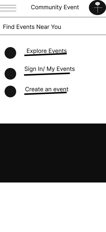
Community Stride Together
A community walk and event platform helping users discover, join, and manage local walking activities.

Start Your Next Adventure
Role: UX/UI Designer
Project type: Mobile app and responsive website
Tools: Figma, paper wireframes, digital wireframes, prototypes
Focus: Community UX, event discovery, booking flow, responsive design
Status: Concept portfolio project
Overview
Community Stride Together is a mobile app and responsive website designed to help people find and join local community walks.
The project focuses on making local events feel welcoming and easy to access. Users can browse walks, view event details, check distance and difficulty, join a walk, and receive confirmation.
The design is built around a friendly, supportive experience that encourages people to get active, meet others, and feel part of a local community.
The Problem
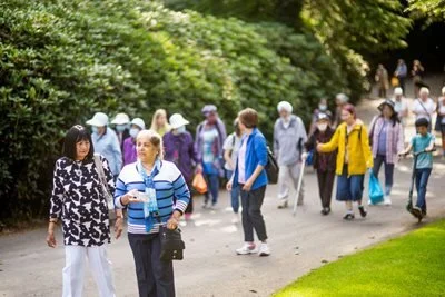
People may want to join local activities but feel unsure where to start. They might worry about fitness levels, accessibility, distance, location, or whether the event will feel welcoming.
The design challenge was to create a platform that made community walks feel easy, safe, and inviting.
Users needed to understand:
what the event is
where it takes place
how long it lasts
how difficult it is
whether it is suitable for them
how to book a place
what happens after booking
The Goal
The goal was to design a simple event discovery and booking experience that helps users:
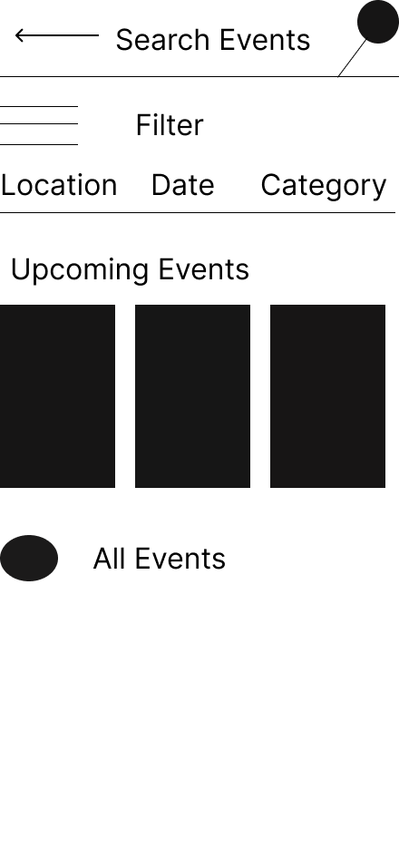
find local walks
compare walk options
understand event details
join a walk easily
confirm their booking
manage or cancel a booking if needed
The experience needed to feel friendly, inclusive, and clear across mobile and desktop.
Target Users
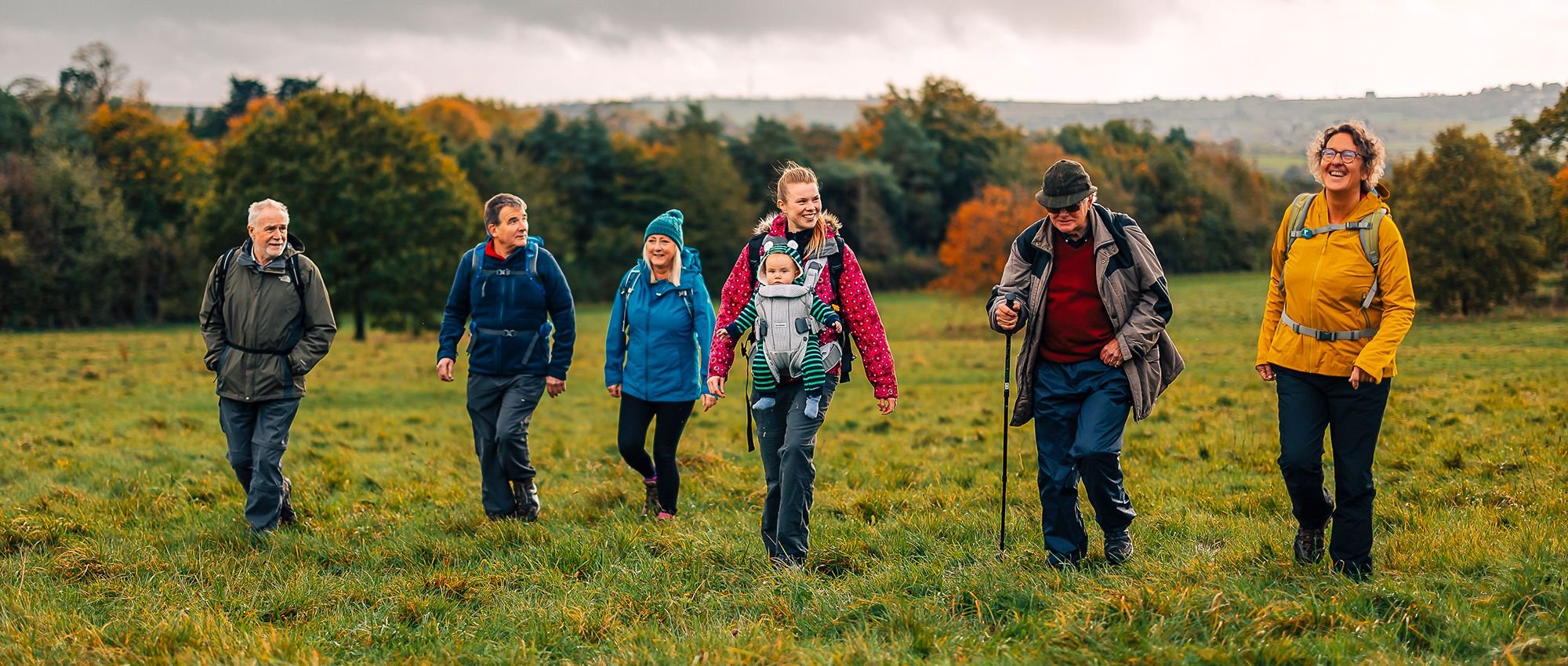
The target users are people looking for local community walks or gentle social activities.
They may include:
people who want to be more active
people who feel isolated
beginners who are nervous about joining
users looking for free community events
people who need clear accessibility information
users browsing on mobile while out and about
The design needed to feel warm and welcoming, not formal or intimidating.
My role
I designed the full experience across mobile app, mobile website, and desktop website.
This included planning the event discovery journey, designing the homepage, creating walk detail pages, building the join flow, designing confirmation and cancellation screens, and adapting the layouts for different devices.
My focus was on making the experience feel simple, encouraging, and easy to complete.
Research-informed insights
1. Users need reassurance before joining
People may want to know the walk is beginner-friendly, free, and suitable for all fitness levels.
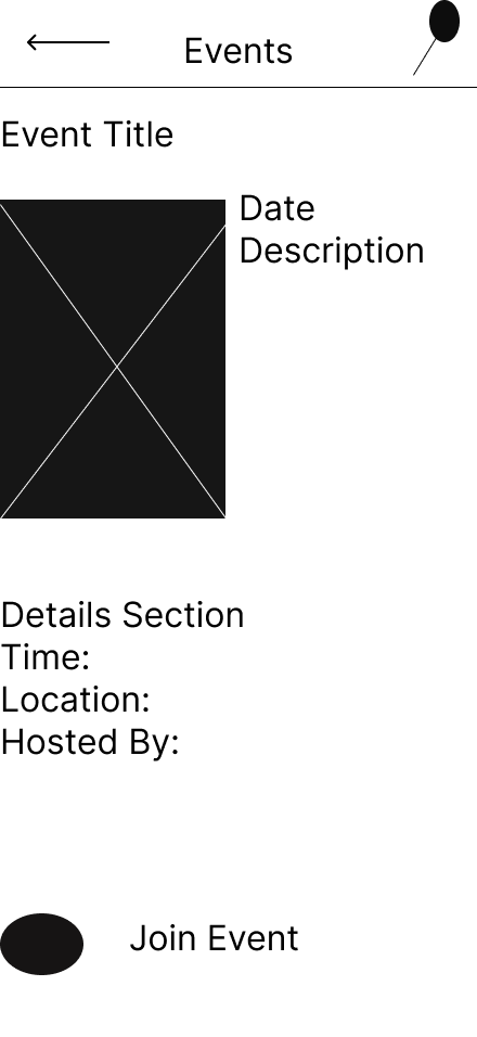
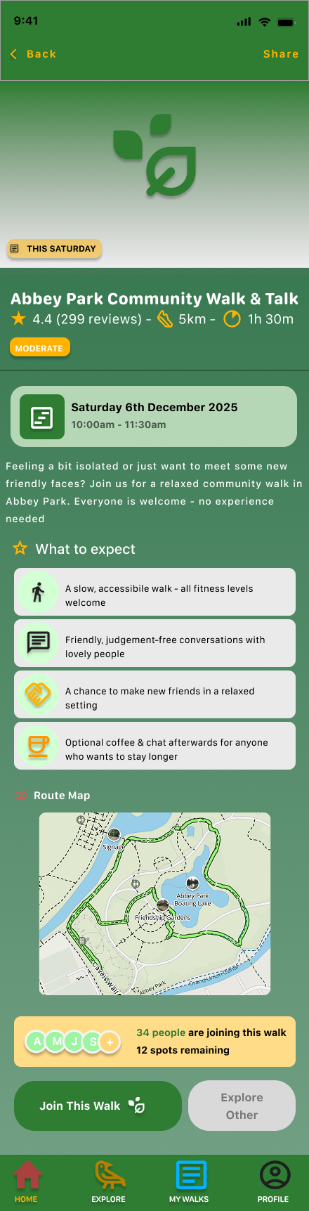
2. Event details need to be visible early
Date, time, distance, location, difficulty, and spaces left should be easy to find.
3. Booking should feel lightweight
Joining a community walk should not feel like a complicated checkout process.
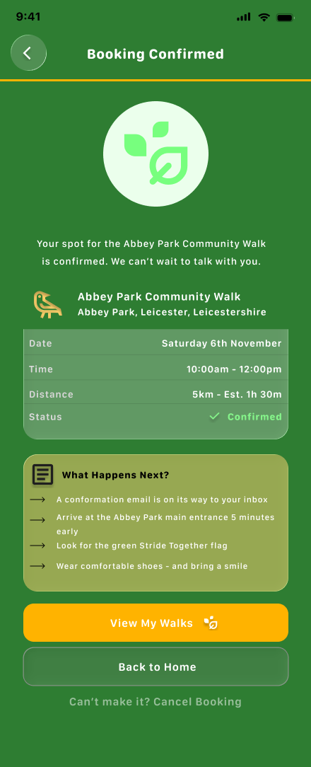
4. Confirmation matters
After booking, users need to know their place is confirmed and what to do next.
User Flow
The main journey is:
Homepage → Browse walks → Walk details → Join this walk → Add details → Confirm booking → View my walks
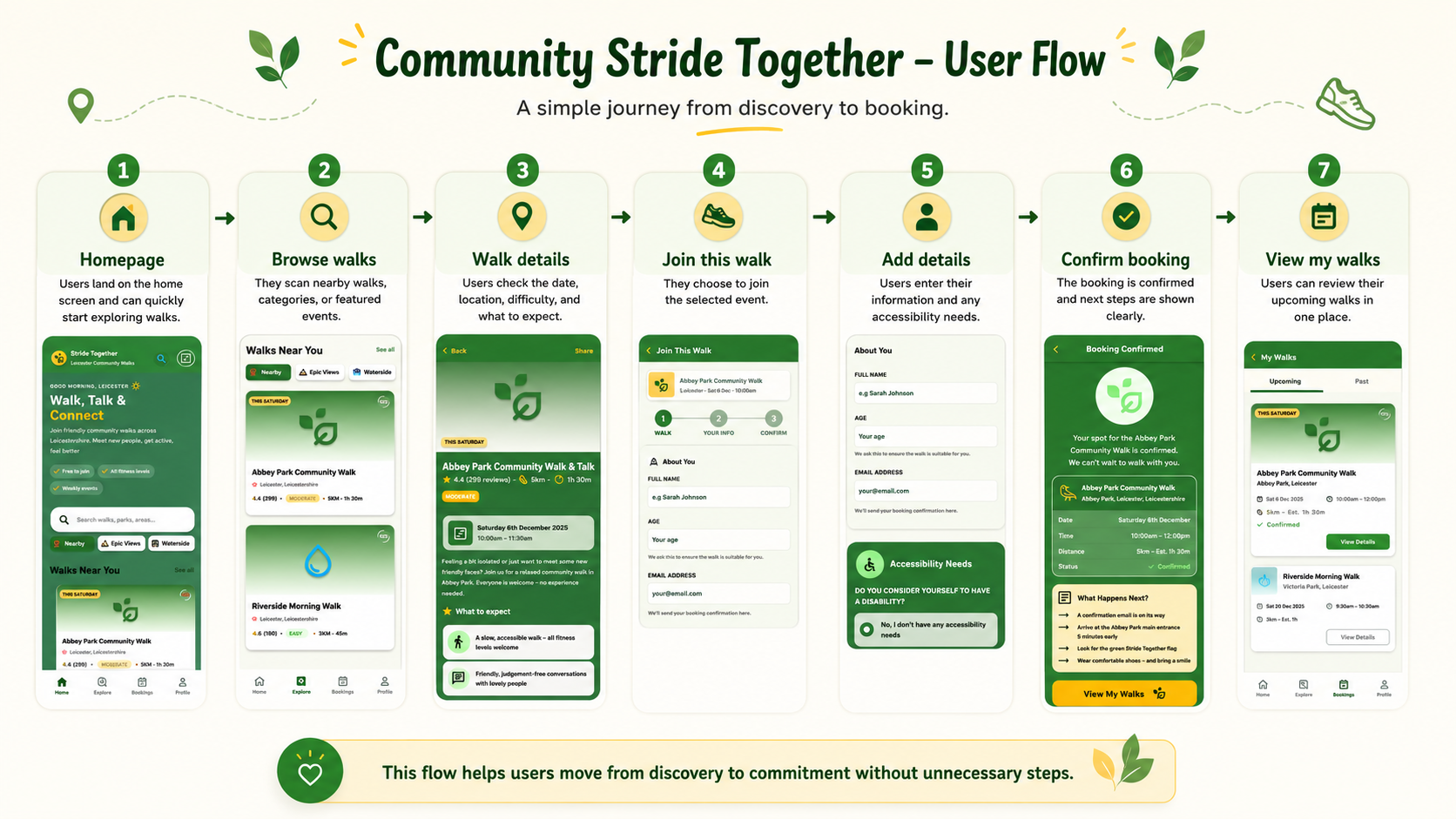
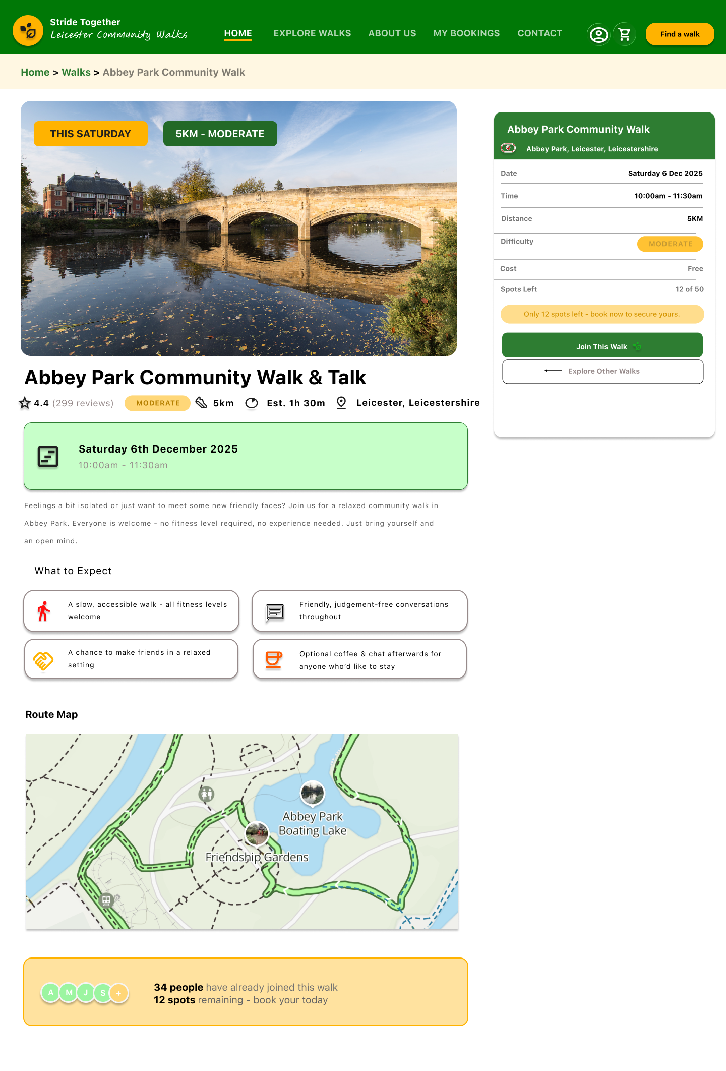
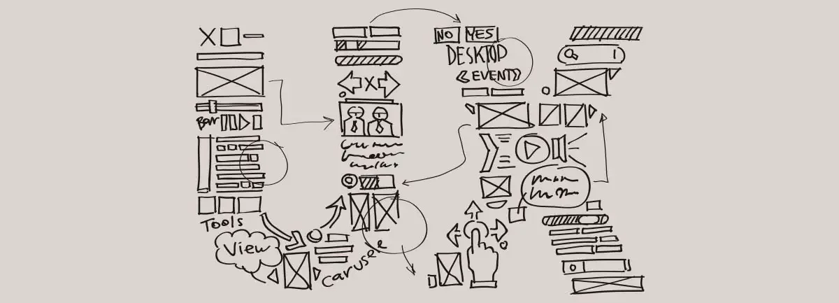
Wireframes & Early Structure
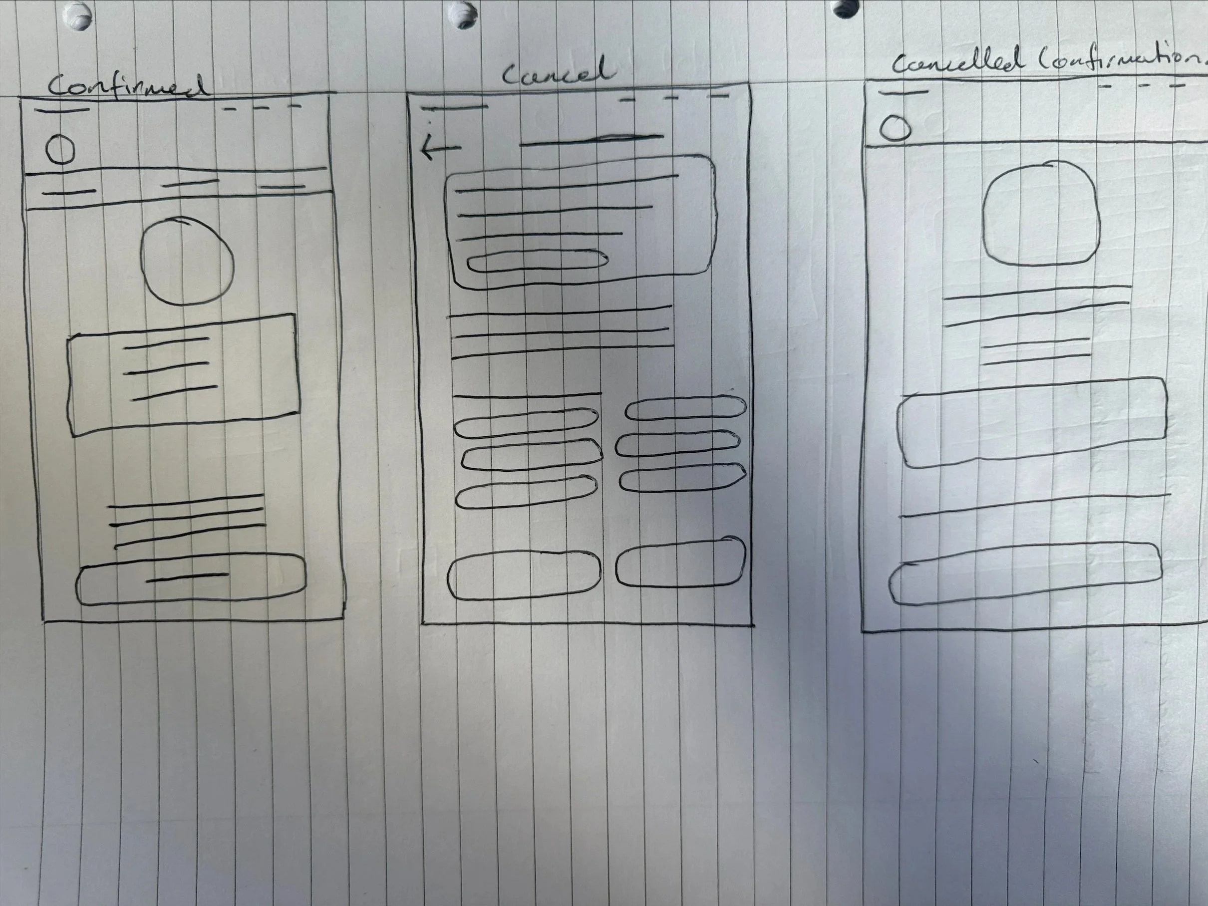

I started with paper wireframes to understand how users would browse and compare events.
The early designs focused on event cards, search, filters, and clear detail pages. I wanted users to quickly understand what each walk offered before deciding to join.
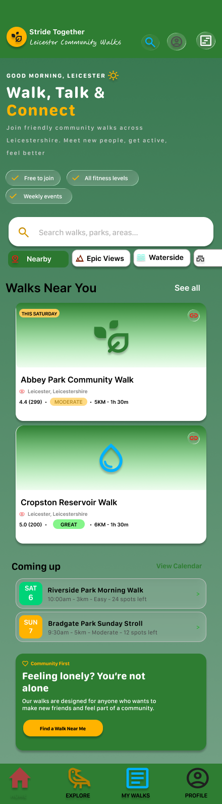
On mobile, I prioritised the event details and booking button. On desktop, I used the wider layout to show event details alongside a booking summary.
Design System / Component Sticker Sheet
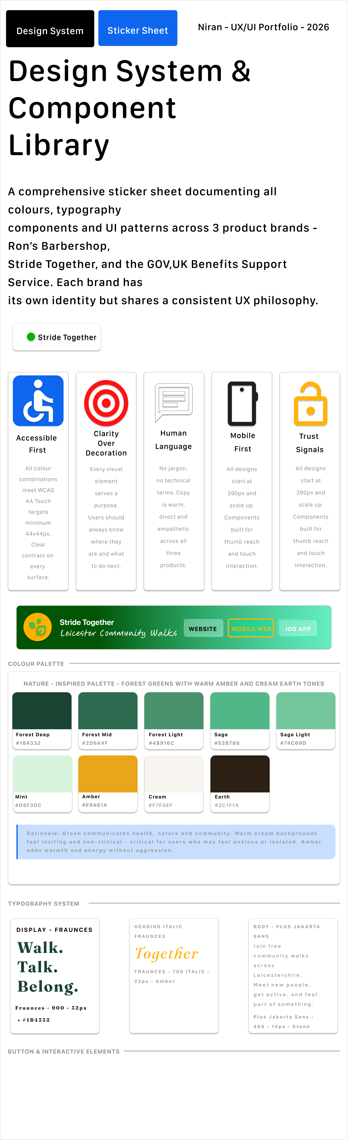
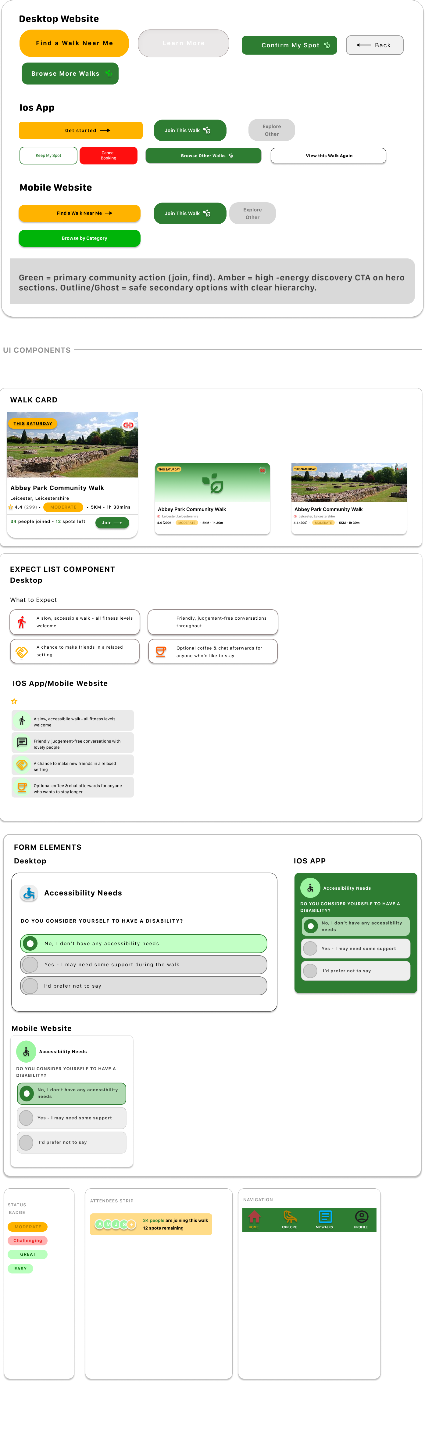
I created a design system to give Community Stride Together a friendly and consistent visual identity. The sticker sheet included event cards, category chips, booking buttons, confirmation panels, accessibility options, icons, navigation elements, and status labels.
The green and yellow colour palette was chosen to reflect nature, energy, and community. Rounded cards and friendly icons helped the product feel welcoming rather than formal.
Key design decisions
The homepage uses friendly language such as “Walk. Talk. Belong.” and “Walk, Talk & Connect” to make the service feel approachable.
2. Clear event cards
Each walk card includes important details such as location, rating, distance, difficulty, and time. This helps users compare options quickly.
3. Strong visual categories
Category chips such as “Nearby”, “Epic Views”, “Waterside”, and “Parks” help users browse based on preference.
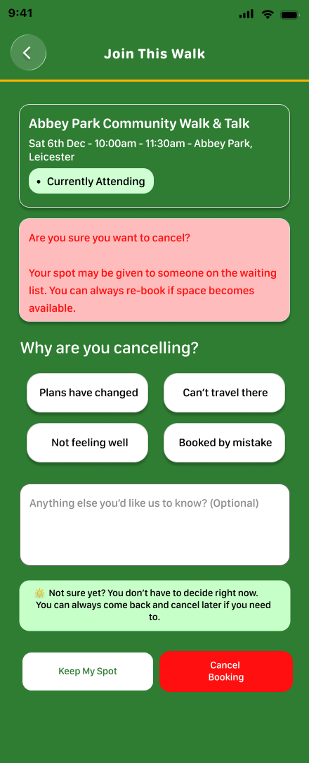
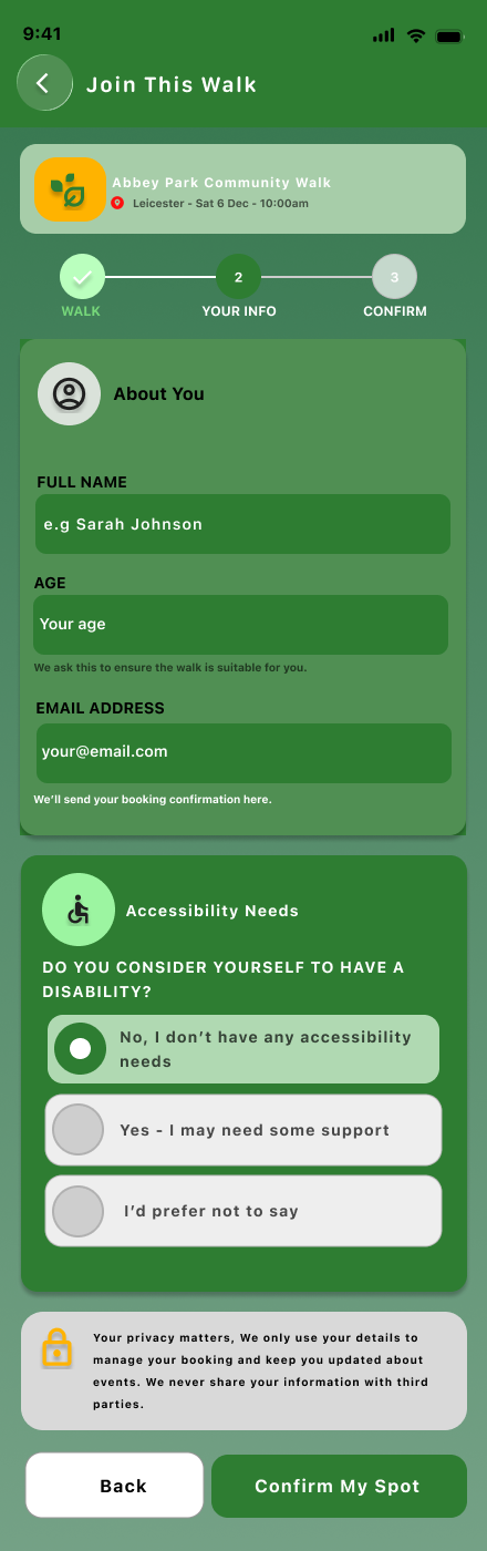
4. Simple join flow
The booking form asks only for necessary information. This keeps the process short and avoids making the user feel like they are signing up for something complicated.
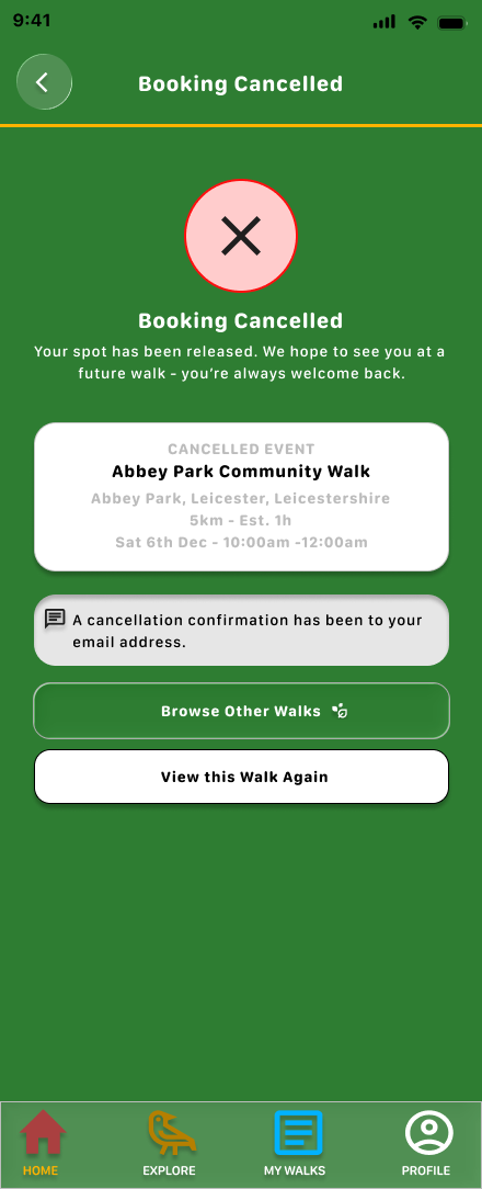
5. Confirmation screen
The confirmation screen clearly tells users they are booked and explains what happens next. This reduces uncertainty after completing the booking.
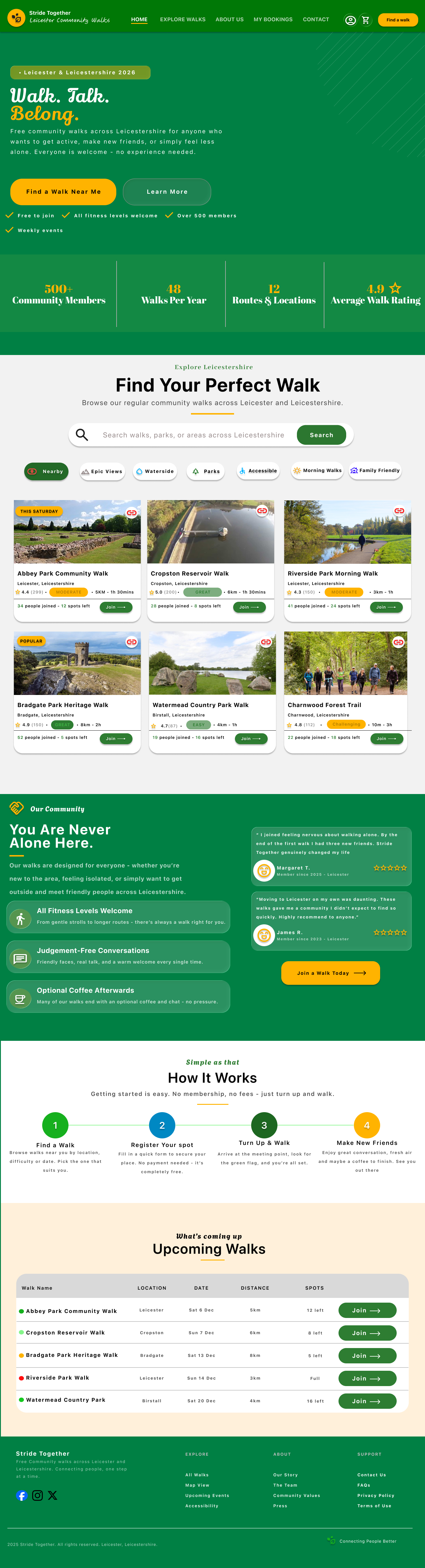

The final design uses green, yellow, and soft neutral colours to create a friendly outdoor feel. The design language supports the idea of community, wellbeing, and accessible local activity.
Responsive Design
The project includes a mobile app, mobile website, and desktop website.
On desktop, the design gives users more space to review event details and booking information side by side.
On mobile, the design becomes more focused and vertical. Users can scroll through event details, tap clear buttons, and complete the join form without distraction.
This helped me practise adapting the same service across different screen sizes while keeping the experience consistent.
Accessibility and inclusion
The design needed to feel inclusive because community events should be open and welcoming.
I focused on:
clear event details
visible difficulty levels
simple language
large buttons
clear booking status
accessibility needs section
confirmation messages
friendly visual tone
mobile-friendly browsing
The goal was to help users feel confident before joining a walk.
Outcome
This project helped me design a complete event discovery and booking journey.
It strengthened my ability to design for community participation, local events, responsive layouts, and simple booking flows.
What I learned