
Digital Benefits Checker
Website & App

A benefits support tool helping users check possible eligibility and understand financial support in a clear, private, and reassuring way.
Role: UX/UI Designer
Project type: Mobile app and responsive website
Tools: Figma, paper wireframes, digital wireframes, prototypes
Focus: Service design, form design, accessibility, trust, results pages
Status: Concept portfolio project
Overview
The Digital Benefits Checker is a mobile app and responsive website designed to help users understand what financial support they may be entitled to.
Benefits information can feel complicated, stressful, and difficult to trust. Users may worry about privacy, whether their answers will affect existing benefits, or whether they are using the right service.
The goal of this project was to create a simple, guided journey that helps users answer a few questions and receive clear eligibility results without feeling judged or overwhelmed.
The problem
People looking for financial support are often under pressure. They may be worried about bills, housing, childcare, or employment. At the same time, benefits information can feel technical, scattered, and difficult to understand.
The main challenge was to design a service that felt:
simple
trustworthy
private
quick to complete
clear about next steps
The design needed to reduce stress, not add to it.
The goal
The goal was to design a benefits checker that helps users:
understand what support may be available
complete a short step-by-step check
feel reassured about privacy
review their answers
see likely and possible benefits
understand what to do next
The experience needed to work well on both mobile and desktop.
Target users
The target users are people who may need financial support but are unsure what they can claim.
They may include:
people on low income
people who are unemployed or working part time
parents and carers
renters or homeowners
people struggling with cost of living
users who may feel anxious about sharing personal information
The design needed to be calm, clear, and reassuring.
My role
I designed the full user journey, from the landing page through to the eligibility results screen.
This included mapping the step-by-step form flow, designing the homepage, creating question screens, building a results page, adding reassurance content, and adapting the experience across mobile and desktop.
My main focus was making the journey feel safe, understandable, and easy to complete.
Research-informed insights


The project was shaped by several key insights:
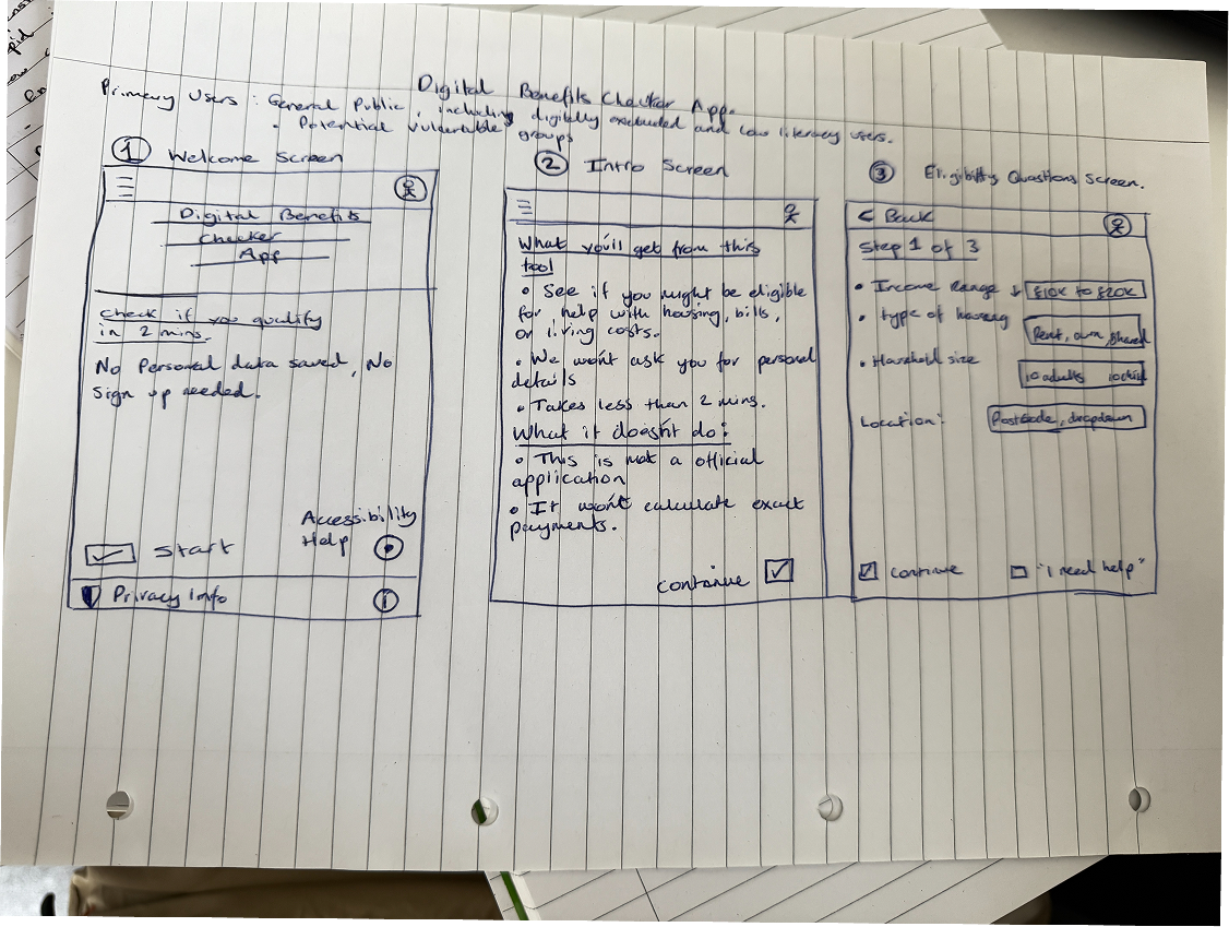
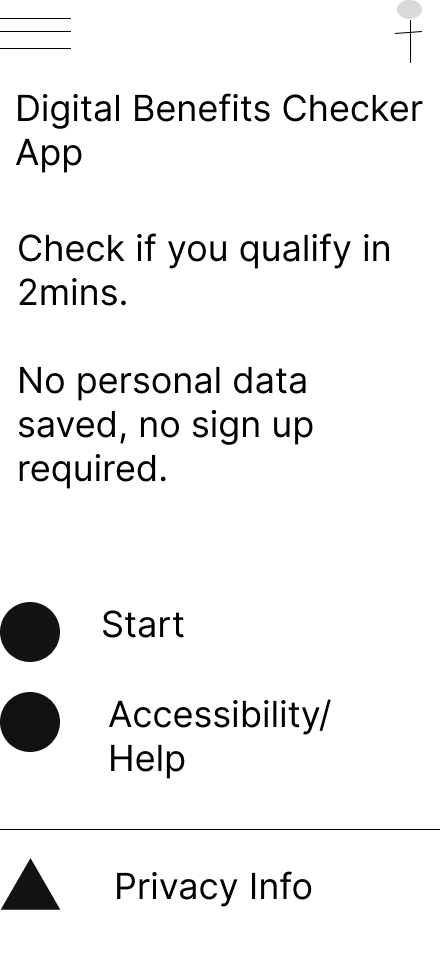
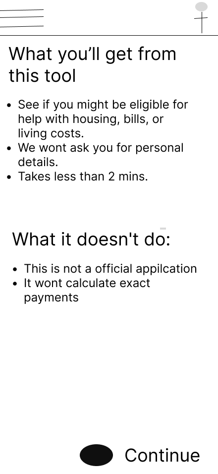
1. Trust needs to appear early
Users need to know that the service is free, private, and will not affect their current benefits.
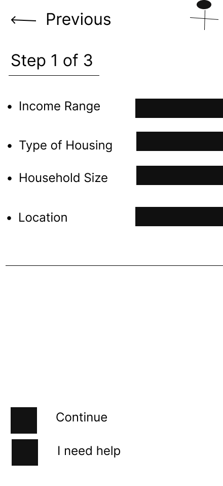
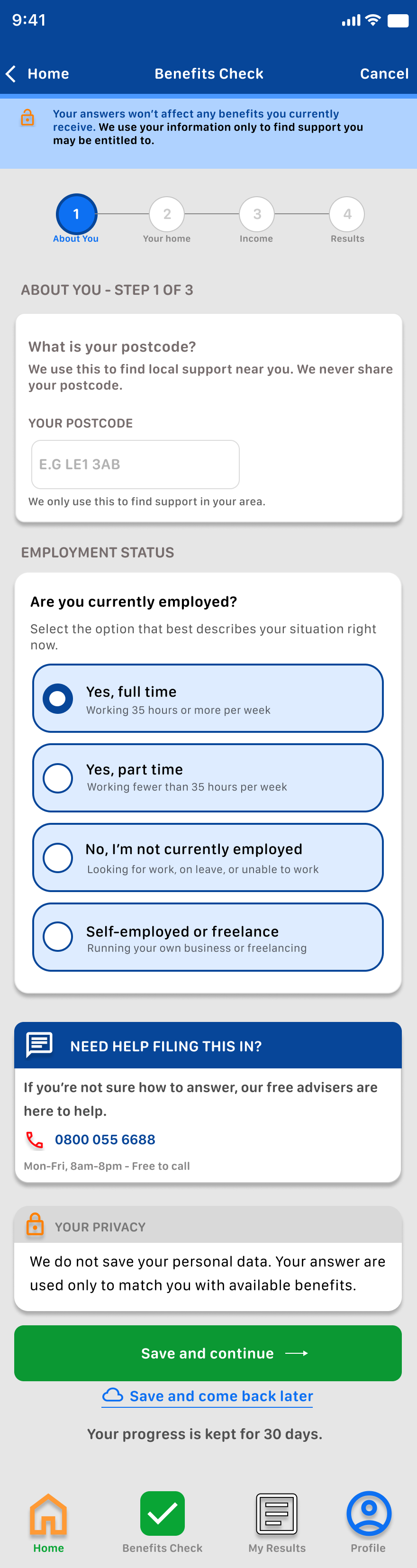
2. Forms need to feel manageable
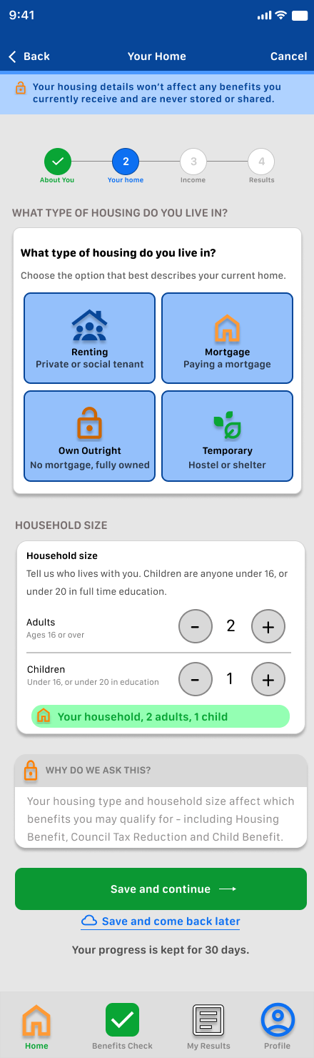
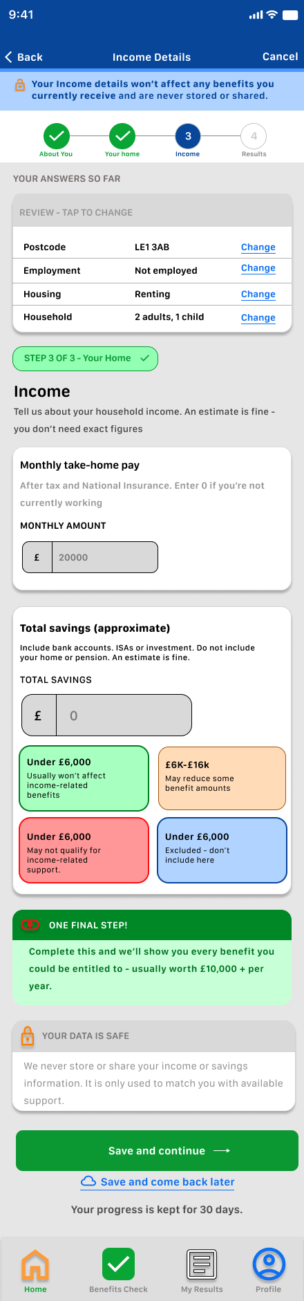
A long form can feel intimidating. I split the journey into short steps with progress indicators.
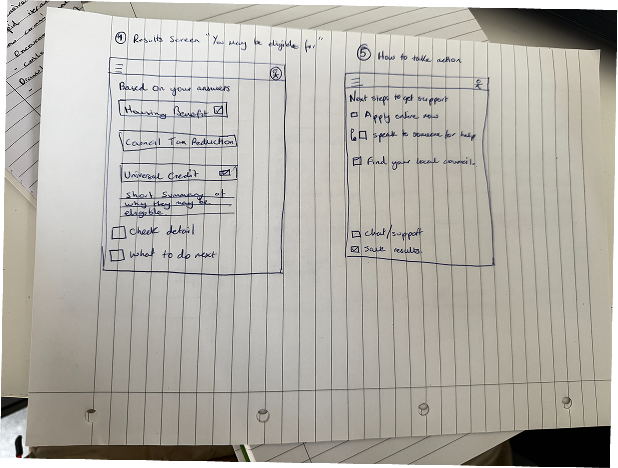
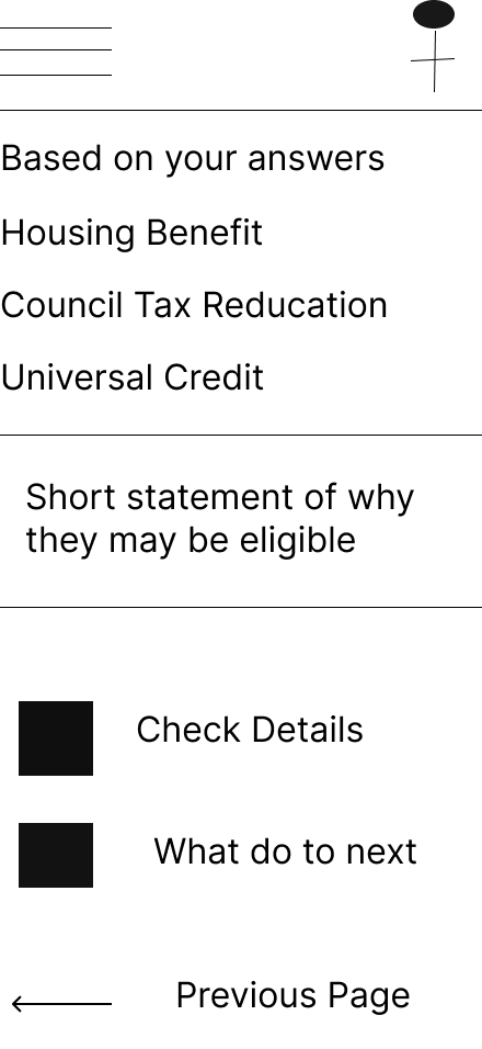
3. Users need clear results
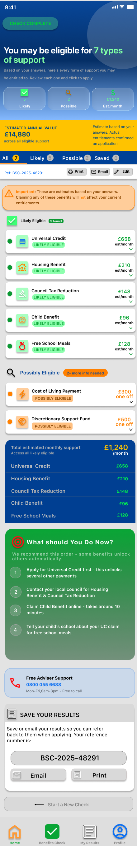
The results page needed to show likely support, possible support, estimated amounts, and next steps in a way that is easy to scan.
4. Reassurance reduces stress
I included messages about privacy, no login, and not affecting benefits to help users feel more confident.
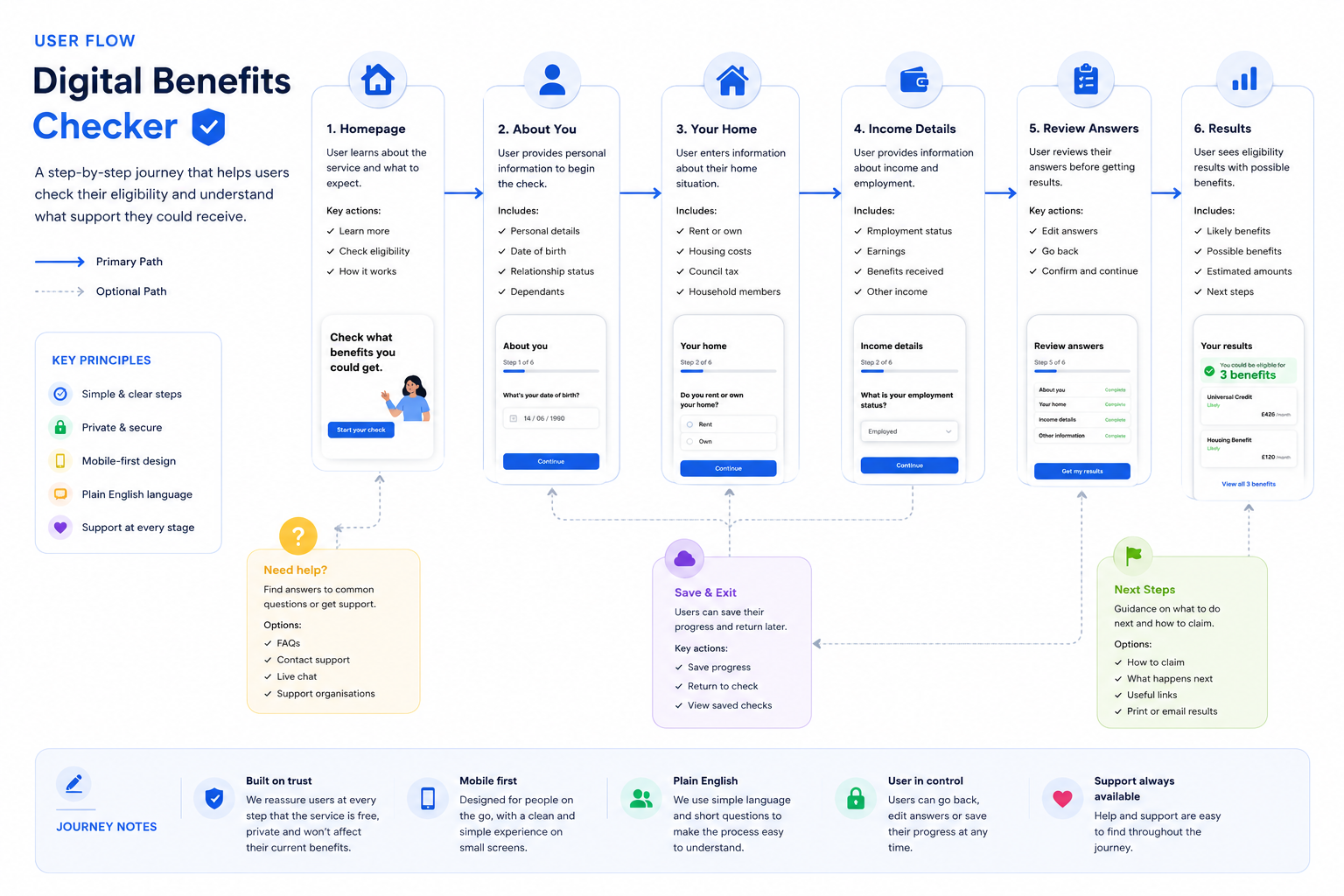
Homepage → Start check → About you → Your home → Income details → Results → Review support → Next steps.
This flow keeps the process focused and avoids asking for too much information at once.


I began by planning the form structure. The biggest challenge was deciding how much information to ask for without making the user feel overwhelmed.
The early wireframes helped me test the order of questions, the placement of reassurance messages, and how the progress indicator would work.
I also explored how the results page could show a lot of information without looking confusing.
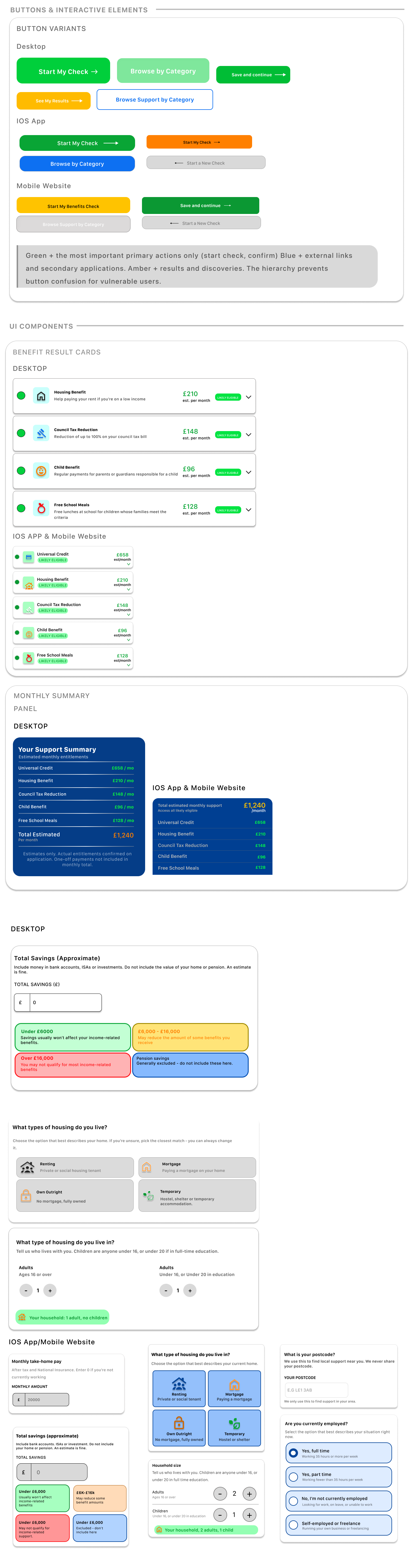
Design System/Component Sticker Sheet
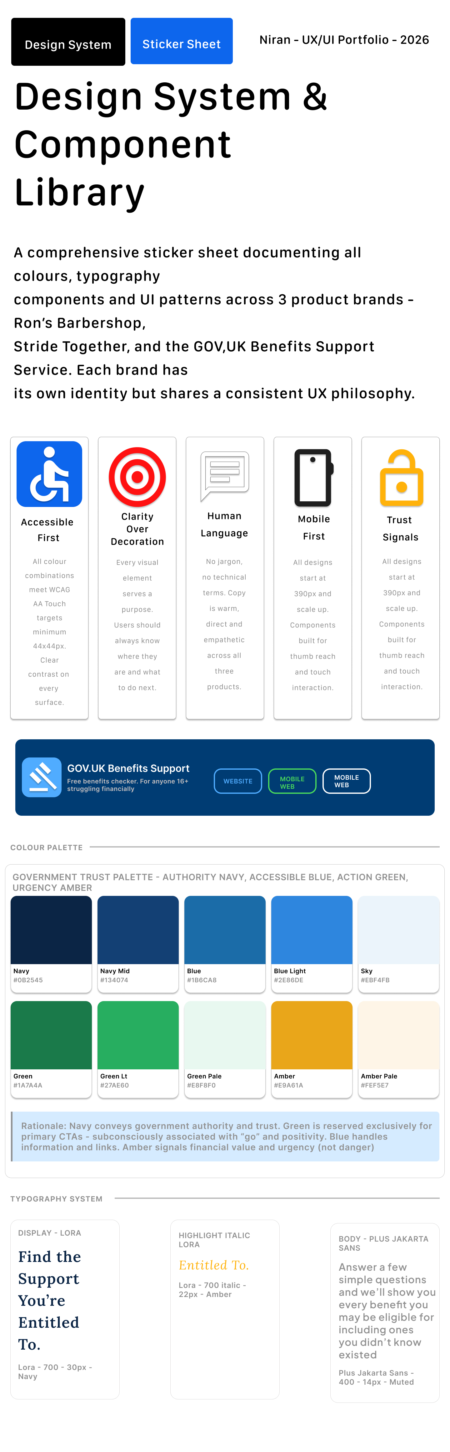
I created a component sticker sheet to keep the mobile app and responsive website consistent. The design system included form fields, progress indicators, buttons, trust badges, support panels, result cards, status labels, icons, and navigation elements.
The colour system was designed around trust and clarity. Blue was used as the main colour, green was used for positive eligibility indicators, and orange was used for important notices and estimated values.
Key design decisions
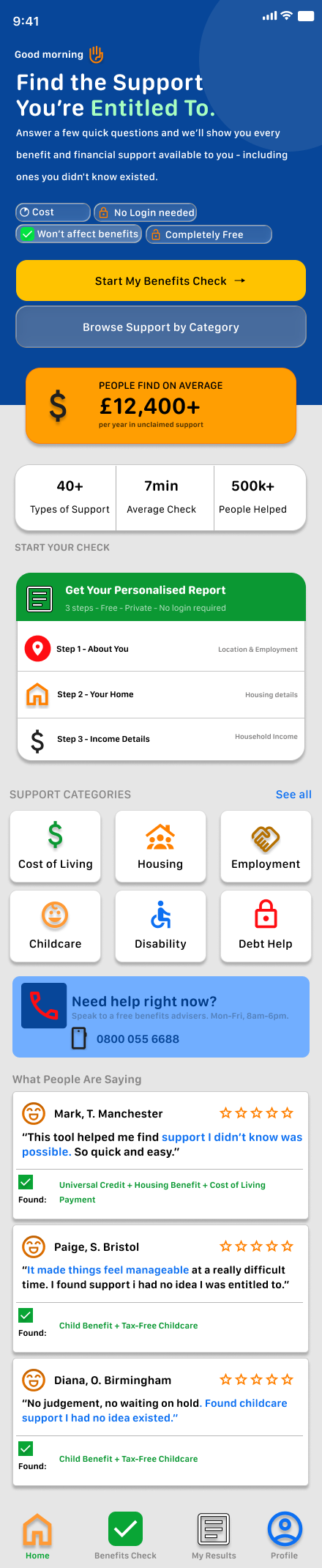
1. Reassurance before action
On the homepage, I included clear trust signals such as “No login needed”, “Won’t affect benefits”, “Completely free”, and “Takes around 7 minutes”.
This helps reduce hesitation before the user starts.
2. Step-by-step progress
The check is split into clear steps. Users can see where they are and how much is left, which makes the process feel more manageable.
3. Simple question cards
Each question is placed inside a clear card. This keeps the page focused and avoids overwhelming the user with too much content at once.
4. Results grouped by confidence
The results page separates likely and possible support. This helps users understand what they may qualify for without making the results feel too absolute.
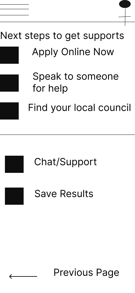
5. Clear next steps
The results page includes actions such as viewing details, printing, emailing, and editing answers. This gives users control after completing the check.
Final Designs
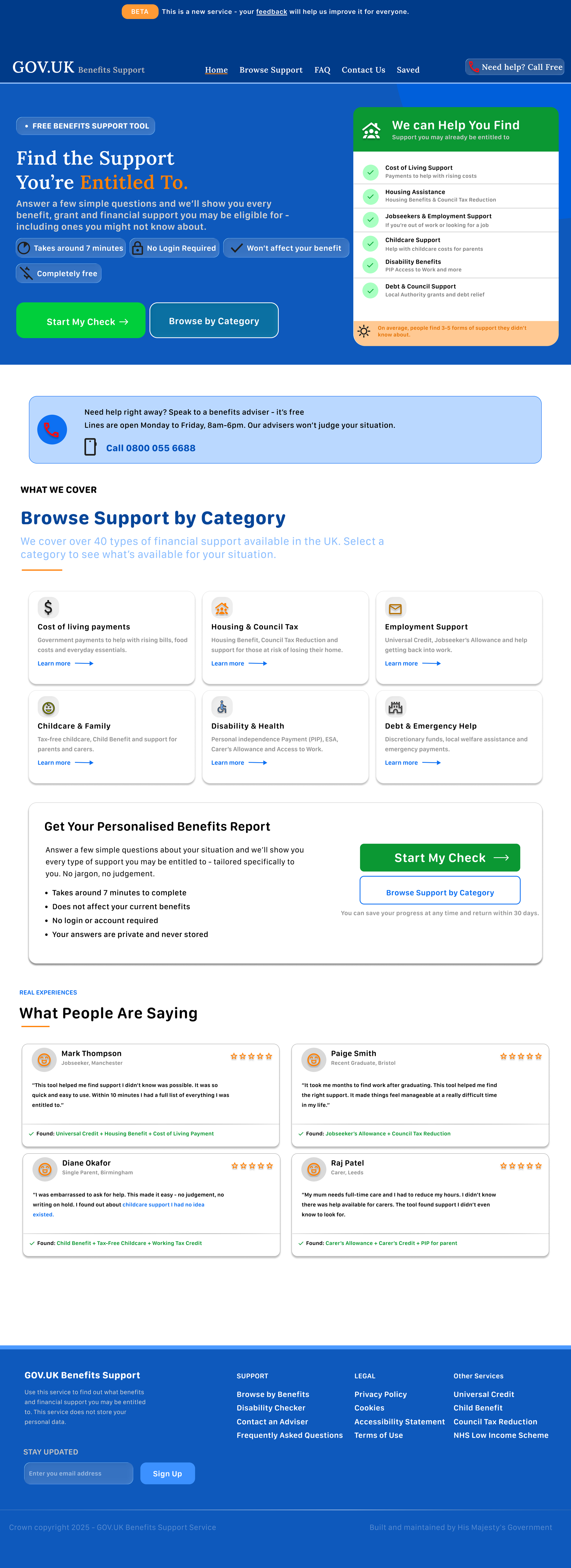
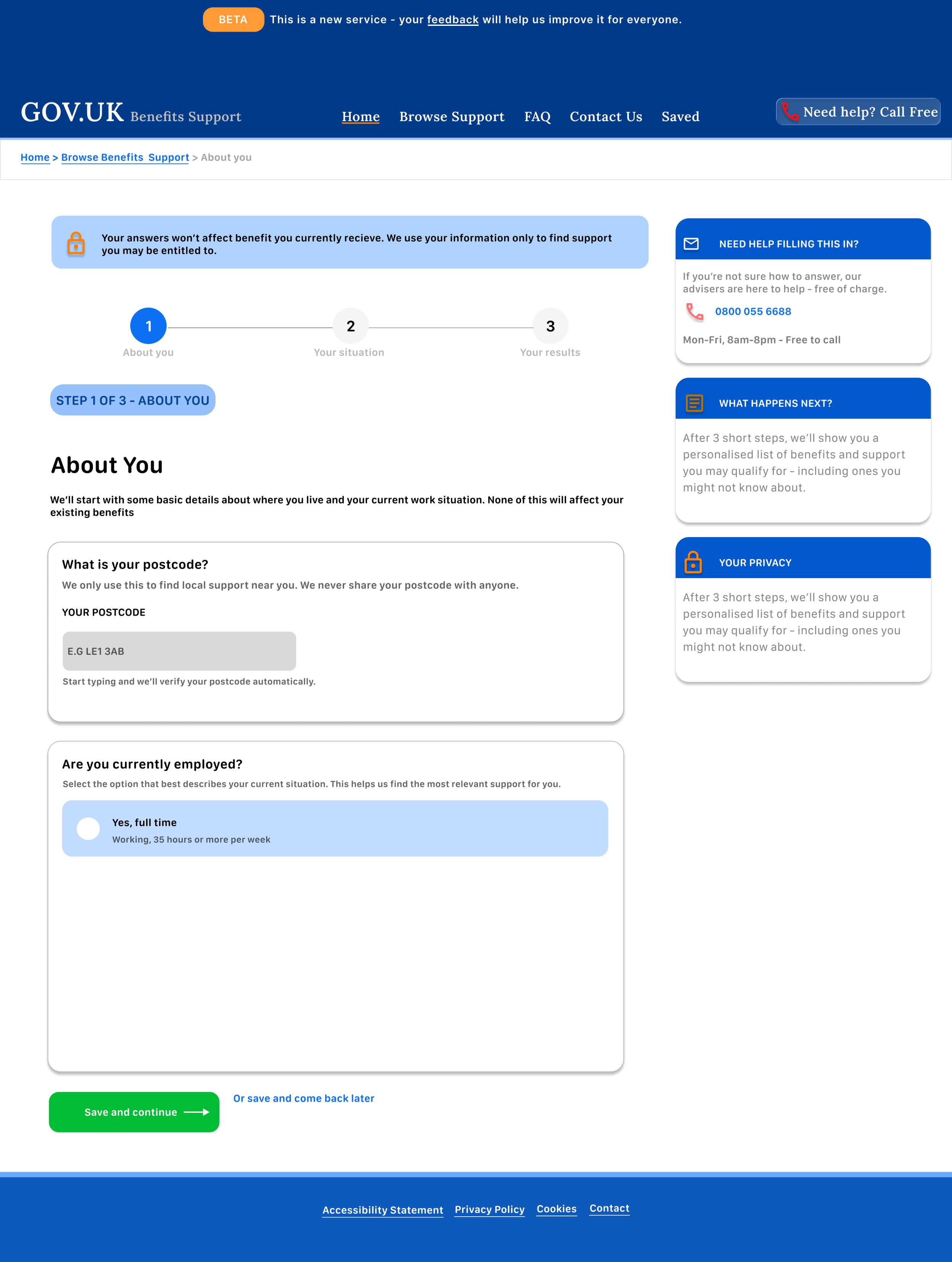
Responsive design
The desktop version gives users more space for support panels, privacy reminders, and side information.
The mobile version focuses on one question at a time. The layout uses large buttons, simple cards, and clear progress indicators to help users move through the journey with confidence.
This project helped me understand how responsive design is not just about resizing screens. It is about changing the structure so the experience still feels clear on any device.
Accessibility and inclusion
Accessibility was important because users may be stressed, tired, or unfamiliar with benefits language.
I focused on:
plain English
short steps
strong contrast
large touch targets
clear form labels
visible progress indicators
reassurance messages
simple results categories
easy-to-scan cards