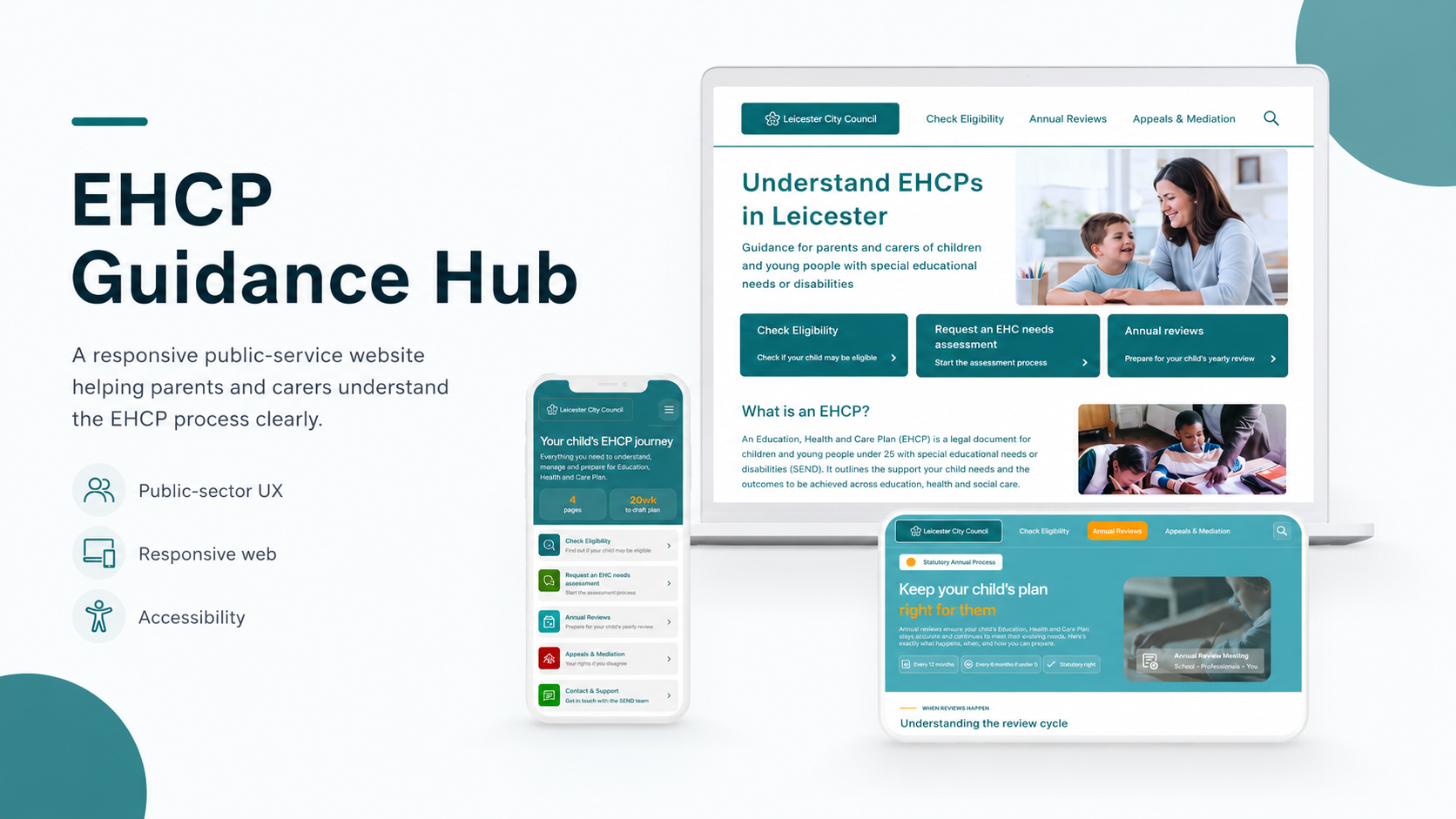
A resposive public-service website helping parents and carers understand the EHCP process with more clarity, confidence and support
Project Type: Responsive Website
Tools: Figma, paper wireframes, digital wires, prototypes
Focus: Public-sector UX, accessibility, information architecture, service design
Status: Concept portfolio project
Overview
The EHCP Guidance Hub is a responsive website designed for parents and carers of children and young people with special educational needs or disabilities.
The aim of the project was to make the EHCP process feel less overwhelming. EHCP information can often feel formal, scattered, and difficult to understand, especially for families who are already under stress. I wanted to design a service that felt calm, structured, and easy to follow.
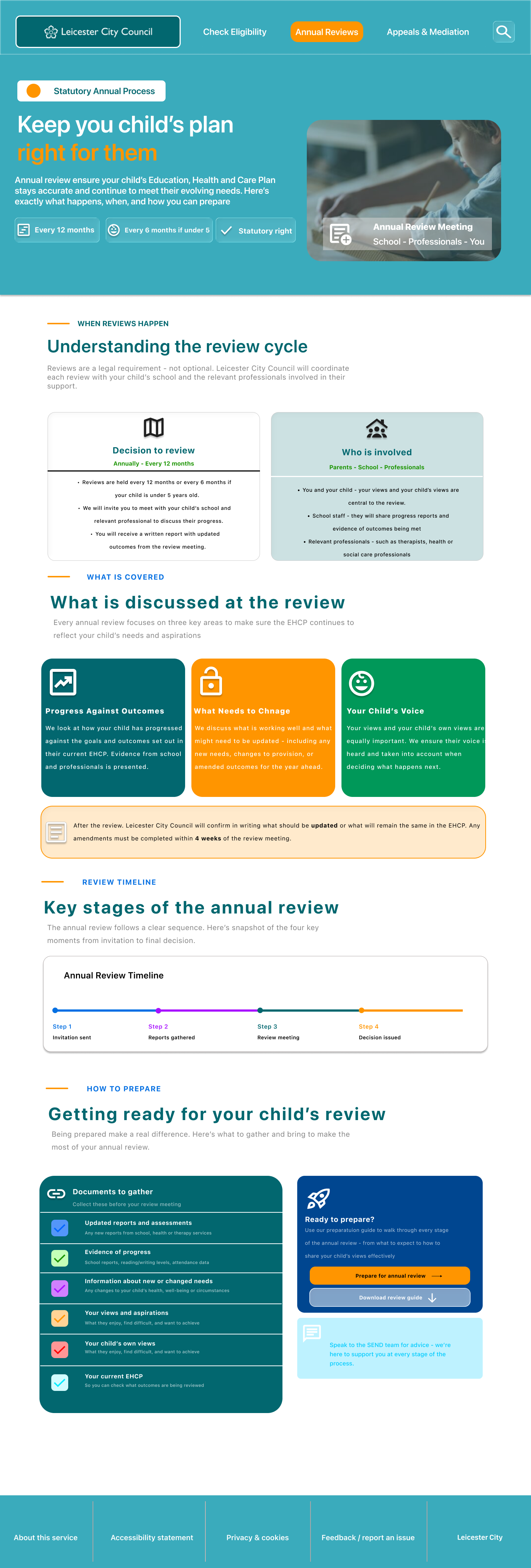
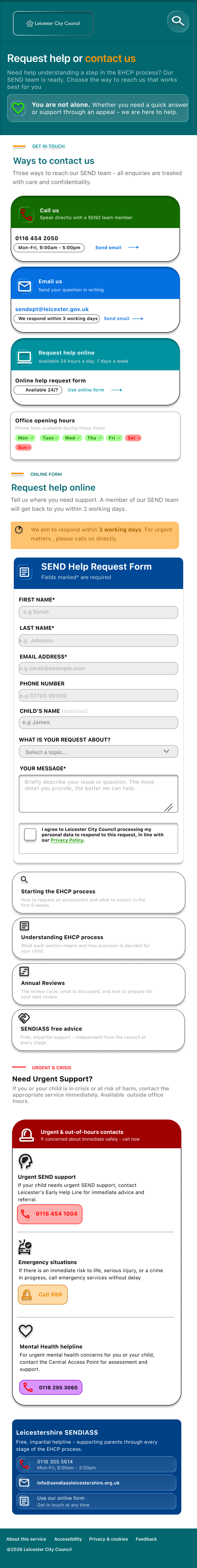
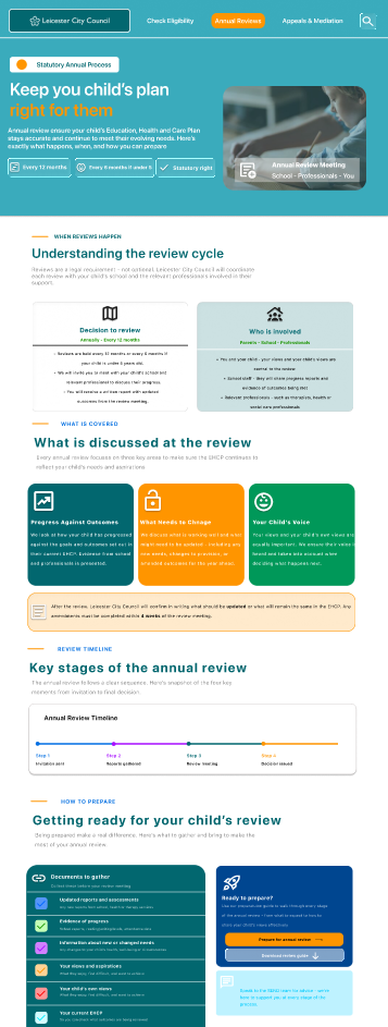
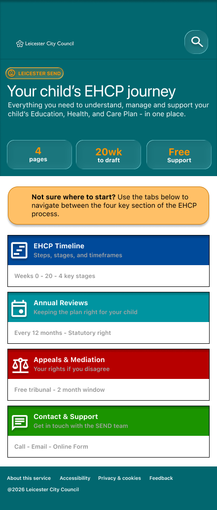
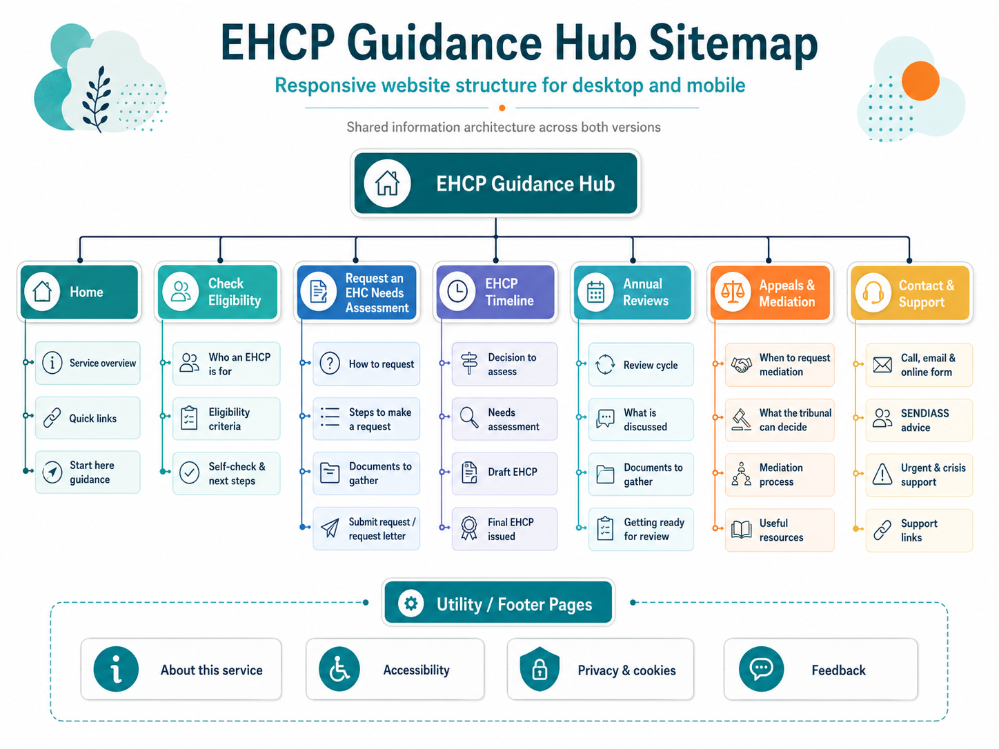
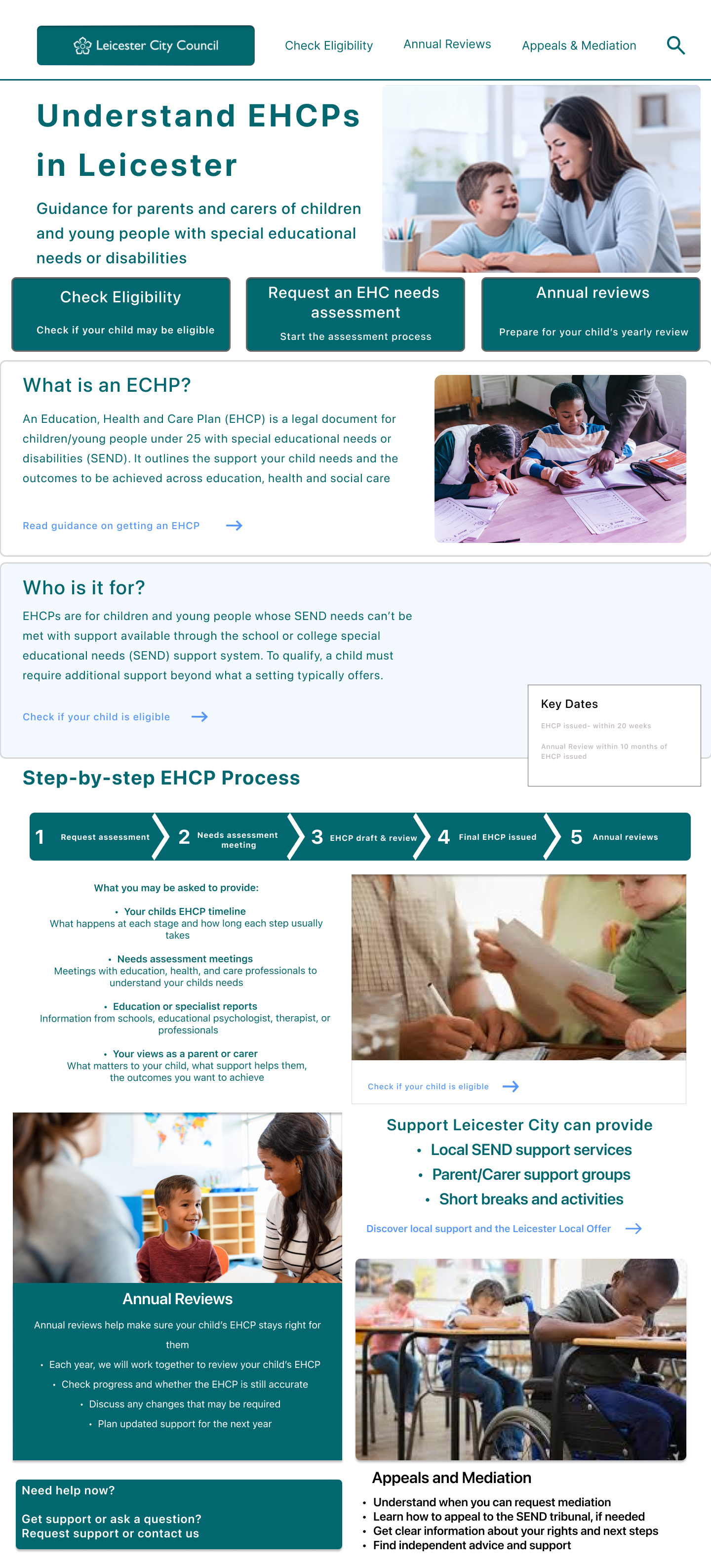
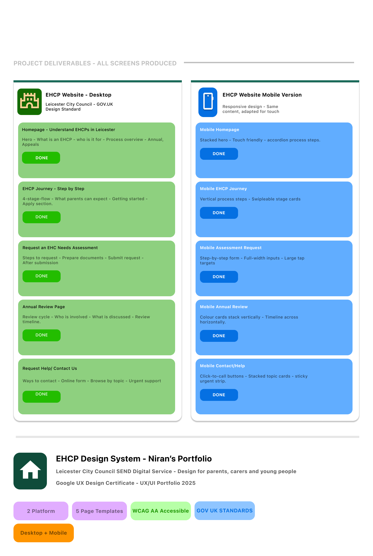
The final design gives users clear entry points into the most important tasks, including checking eligibility, requesting an EHC needs assessment, understanding the timeline, preparing for annual reviews, learning about appeals and mediation, and contacting the SEND team for help.

The Problem
Parents and carers may need to understand the EHCP process at a stressful point in their lives. They might be worried about their child’s needs, unsure what support is available, or confused by formal language.
The main problem was that EHCP information can feel difficult to navigate. Users may not know where to start, what each stage means, or who to contact when they need help.
The design challenge was to turn a complex statutory process into a clear, supportive digital journey.
The goal
The goal was to design a responsive website that helps parents and carers:
understand what an EHCP is
check whether an EHCP may be appropriate
request an EHC needs assessment
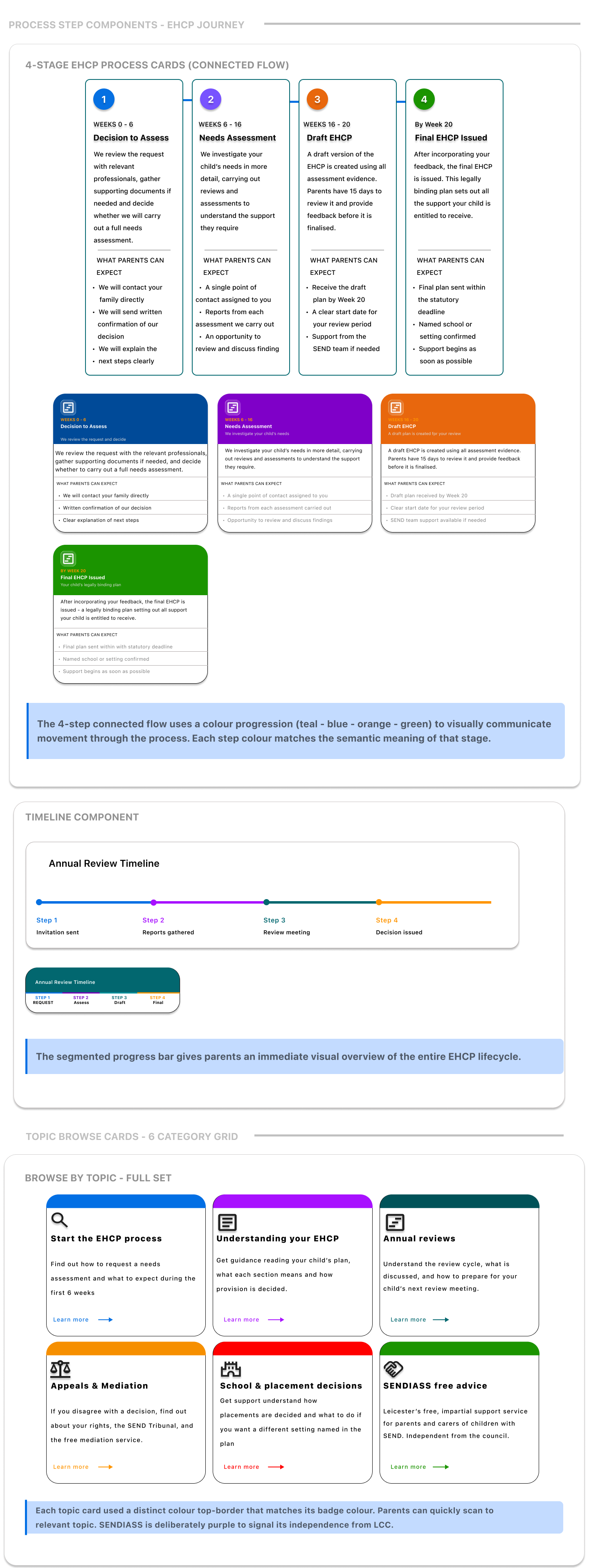
understand the process and timeframes
prepare for annual reviews
understand appeals and mediation
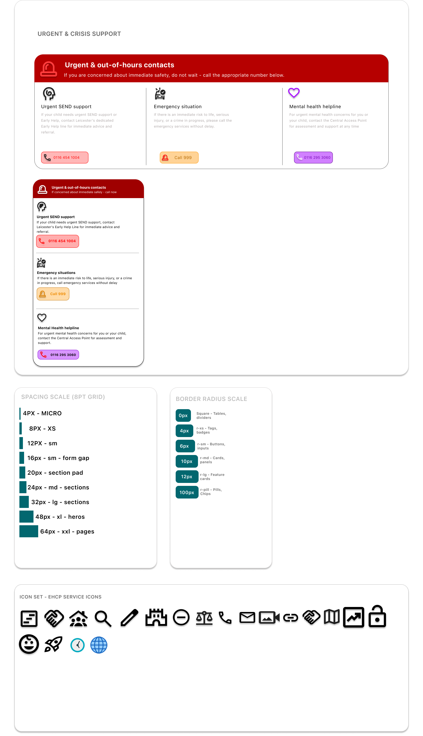
contact the right support team when needed
The website needed to feel trustworthy, accessible, and easy to use across desktop and mobile.
Target users
The primary users are parents and carers of children and young people aged 0–25 with special educational needs or disabilities.
These users may be:
new to the EHCP process
unsure whether their child may be eligible
looking for plain English guidance
stressed or time-limited
using a mobile phone to access information
trying to understand what action to take next
The design needed to support users who may feel anxious, confused, or overwhelmed.
My role
I worked across the full UX/UI design process. This included structuring the website content, planning the user journey, sketching paper wireframes, creating digital wireframes, designing desktop and mobile layouts, refining high-fidelity screens, and considering accessibility throughout the design.
My focus was not just on making the screens look clean. I wanted the service to feel practical, reassuring, and easy to understand.
Research-informed insights
From reviewing the type of information parents need during the EHCP process, I identified four key insights:
1. Users need a clear starting point
Many parents may not know whether to check eligibility, request an assessment, or contact support. The homepage needed to give users clear task-based entry points.
2. Plain English is essential
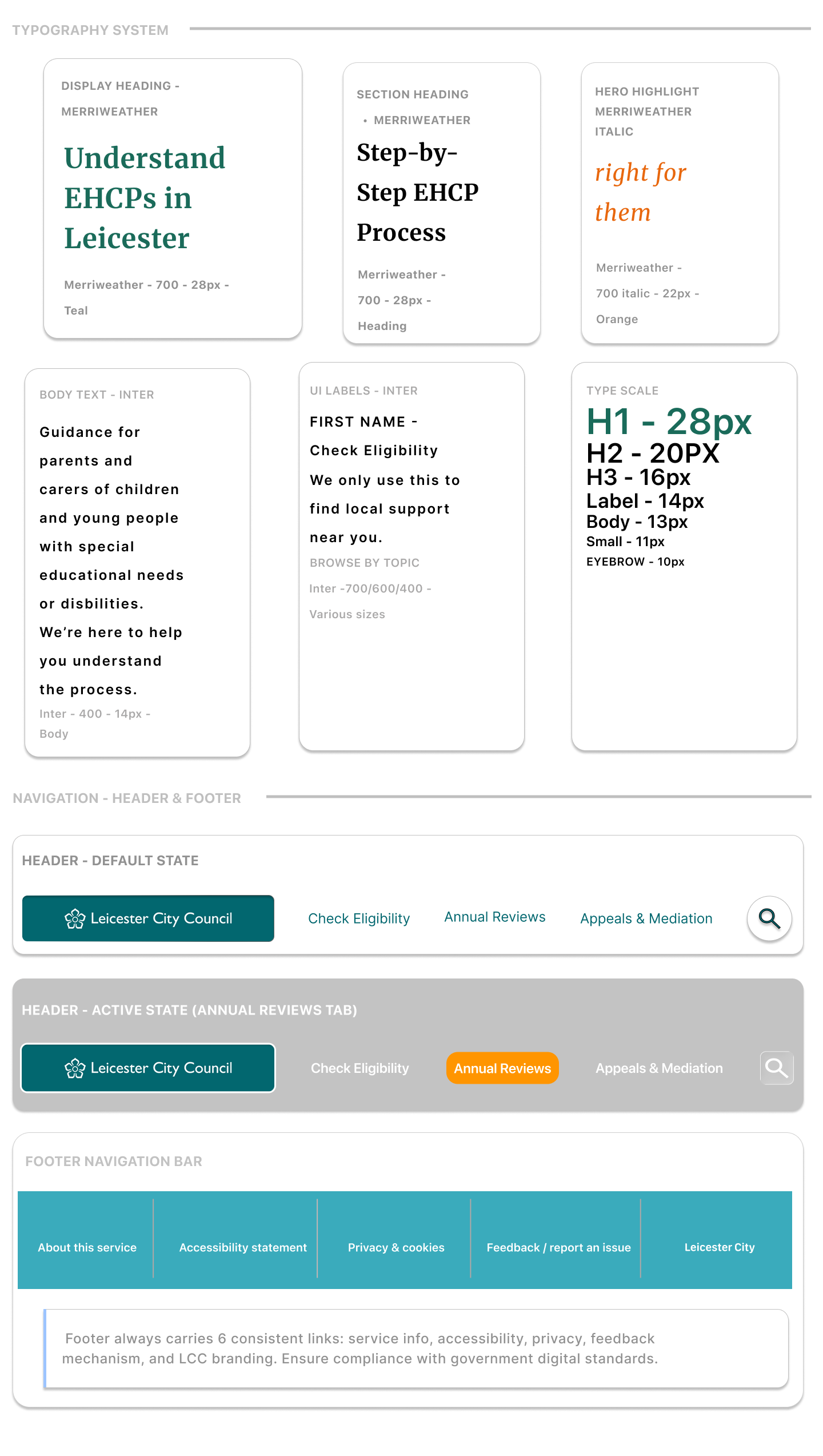
Formal wording can make the process feel intimidating. I used short headings, simple explanations, and direct language to reduce cognitive load.
3. Mobile access matters
Parents may search for support on their phone, especially when dealing with school, health, or family responsibilities. The mobile design needed to be simple, stacked, and easy to scan.
4. Help should always feel close
Users may feel unsure or overwhelmed. Contact and support options needed to be visible, calm, and easy to access.
The main user journey is:
Homepage - Check eligibility - Request an EHC needs assessment - Understand the timeline - Annual reviews - Appeals and mediation - Contact support
This flow helps users move from understanding the service to taking action, while still allowing them to jump to the section most relevant to their situation.
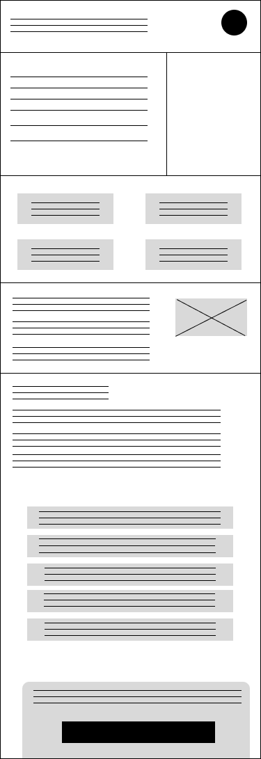
Wireframes & Early Structure
User Flow
Key design decisions
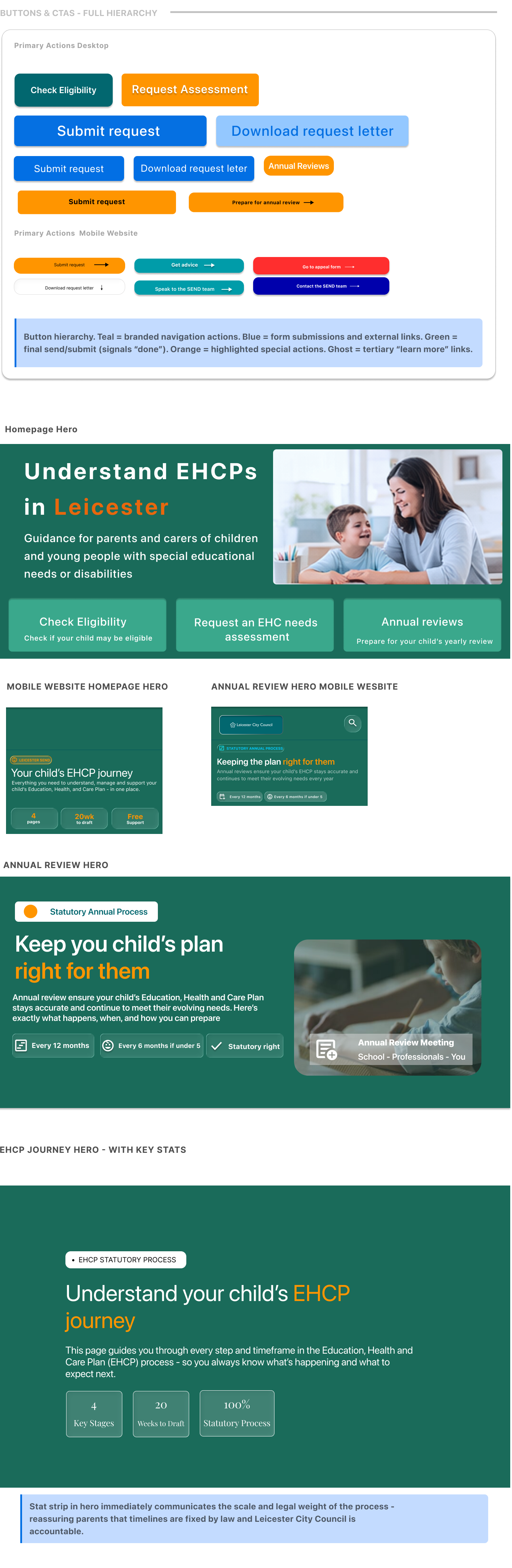
1. Task-based homepage cards
I used clear cards for the main actions: check eligibility, request an assessment, timeline, annual reviews, appeals, and contact support.
This helps users choose what they need without reading a long page first.
2. Calm visual style
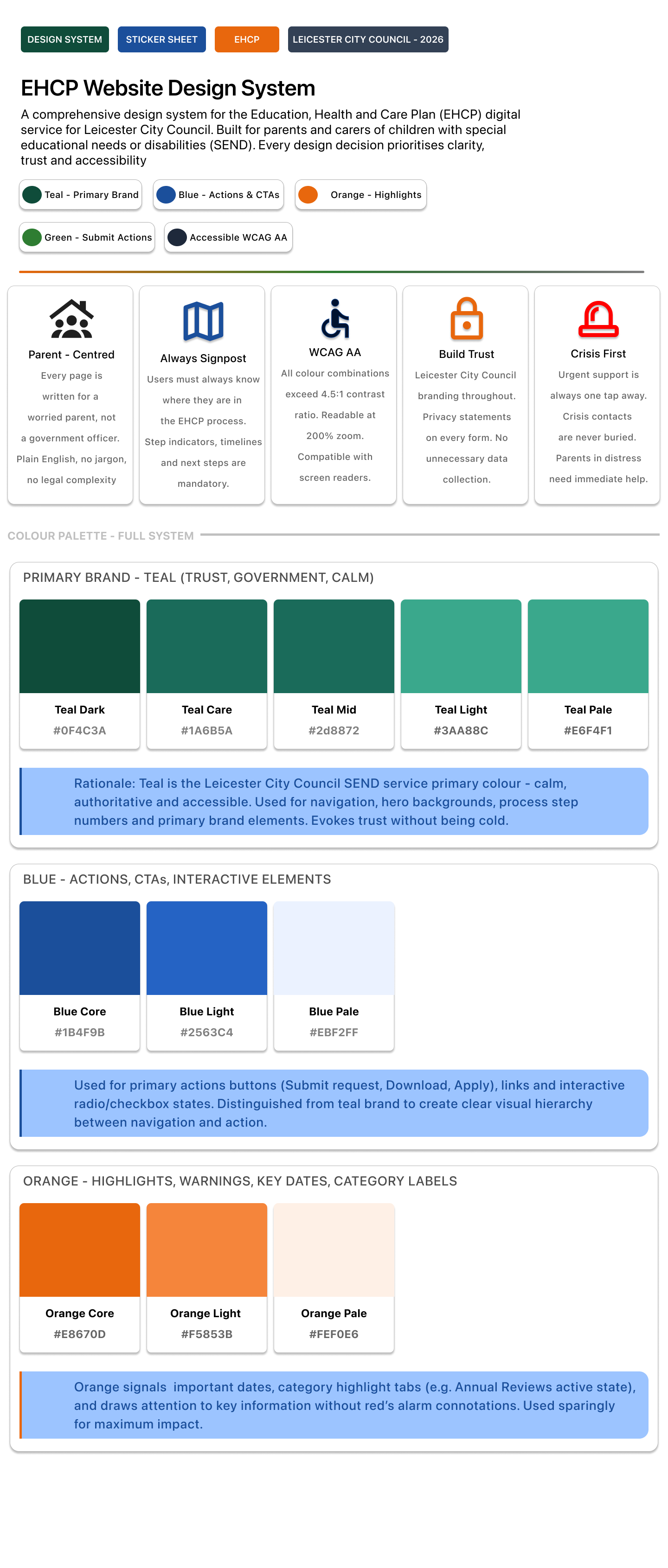
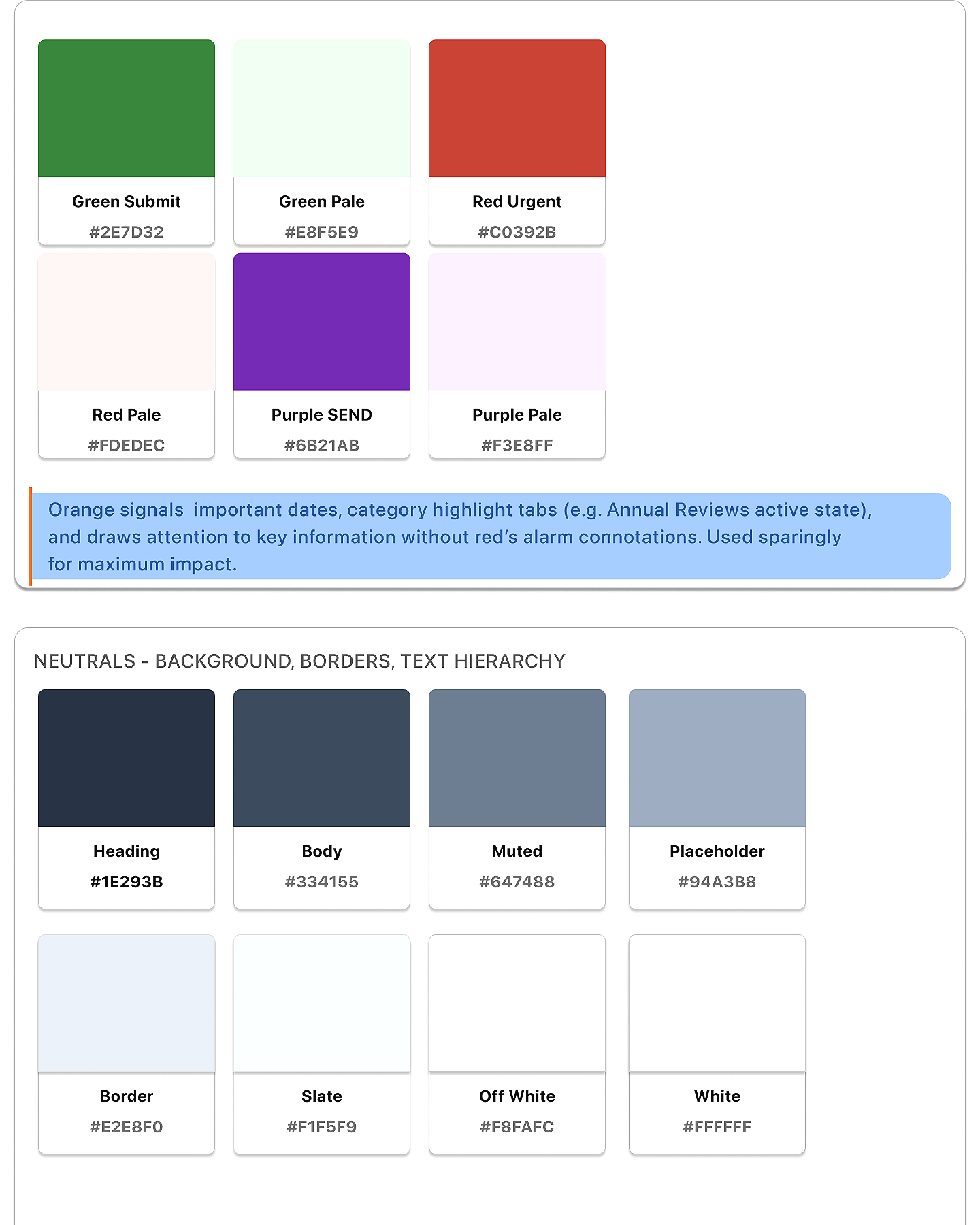
I used a calm colour palette with teal, white, and supportive accent colours. This helped the design feel official but not cold or intimidating.
3. Plain English content
I avoided heavy legal language where possible. The page titles and supporting text explain what users can do in simple terms.
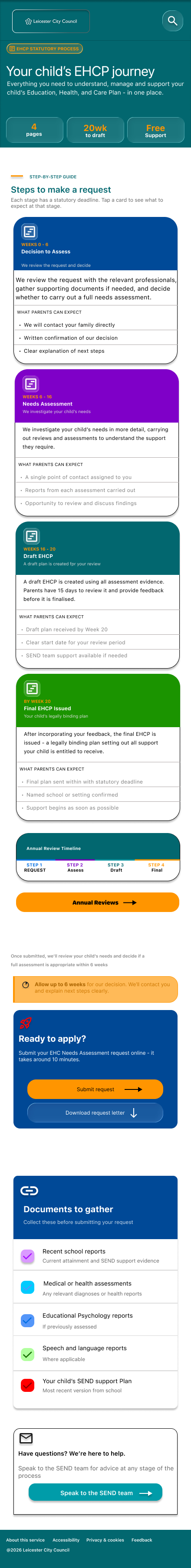
4. Mobile-friendly structure
The mobile version uses stacked cards, large tap areas, clear headings, and short content sections. This makes it easier for users to scan and move through the content.
5. Repeated support routes
The contact and support page is designed to reassure users that they are not alone. It includes call options, email, online forms, urgent support, and SENDIASS signposting.
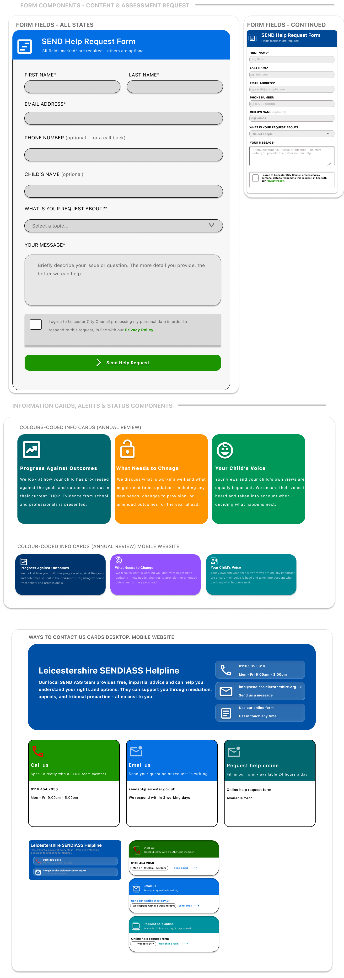
Design System/Component sticker sheet
I started with low-fidelity wireframes to focus on structure before visual design. The early wireframes helped me decide where key tasks should sit on the homepage and how complex content could be broken into smaller sections.
One important decision was to avoid hiding key information deep in the website. Instead, I placed the most important tasks close to the top of the homepage so parents could quickly choose the right path.
On mobile, I changed the layout into a single-column structure. This made the content easier to follow and avoided forcing users to compare too many things at once.